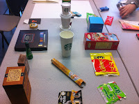
When we arrived today we were asked to get into groups and gather all our collected products together, as a group we needed to then arrange each product into 1 of 3 sections.
High Quality
Medium Quality
Low Quality
This was a good opportunity for us to actually hold and play with a large amount of printed items, some being nicer than others, but it was interesting actually having to analyse why we were putting certain packages in certain groups. it created good discussion as obviously a lot of it is down to personal taste.
High Quality
Medium Quality
Low Quality
Our 5 points of analysis, highlighting the 5 main areas of each group and what aspects decide that they are in the certain group
After doing this task as a group we then had a class discussion trying to highlight the main areas that fell under each category.
there was some disagreements in areas but at the end we all seemed to agree on the points below.
High Quality
- Nice Feeling Stock
- Sustainability
- Looks Expensive
- Durable
- Net Complexity
Medium Quality
- Dispossibility
- Having both positive and negative aspects to a design such as - good durability but awful design.
- Lower Quality Design
- Familiarity of designs (coke, cadbury's commonly seen designs)
Low Quality
- Overcrowded designs
- Garish Colours
- Mass productions (visually)
- Poor quality visuals
- Attempted mimicking
- Over packaging (packaging that is not needed)


No comments:
Post a Comment