Sunday, 20 January 2013
Design Production // Design for print and web - Environment type Environment Magazine logo development
I wanted quite a bold out standing logo that can be the single element on the cover, while also working throughout the rest of the publication.
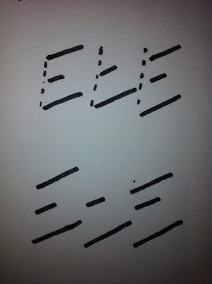
These are just some quick initial sketches.
I think there will be some clever ideas that come from abbreviating Environment Typography Environment, as ETE have some similar shapes and patterns in there form so there will be some good opportunities to play around with that.
One of the key elements for this logo i think will be the choice of font, having played around with a few bold/ ultra bold/ condensed fonts I think my favorite is Gotham Ultra, it is a really good looking heavy font which suits uppercase.
as you can see here below
Subscribe to:
Post Comments (Atom)


No comments:
Post a Comment