I think that we found ourselves in a situation where we ended up rushing to get the book completed for the presentation, which resulted in us not preparing the presentation as well as we could have, we tried to focus on our design and concept processes as well as design development. but one of the comments we got back from Amber was
- The presentation did not show the amount of work we quite clearly put in over the last 2 weeks.
I completely agree with this, and if we were in a situation where we were trying to sell our idea to clients, we may have not go a good result as I don't think we clearly and understandably promoted our guide.
Next time a presentation is necessary I will make sure that the presentation is focused on as an important aspect of the brief as well as ensuring all the necessary information is presented in the right way. Another few questions or peices of advice were raised following our presentation, by tutors and peers.
- If possible the book should have remained passport size.
I think our group all agreed on this aspect, but we also knew we had to make some sacrifices considering the time scale we were given, but if further development took place ten I believe this would be the first problem I would try and resolve.
- Would we sell our guide or hand it out for free?
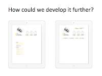
This was an issue that was raised a couple of times by our group but it wasn't something that we felt was important to the brief in our situation, However I think if we were to develop David's idea of the interactive website and Iphone app then maybe some form of registration fee would be asked for, resulting in a package being available once purchased. the guide would be sent for no added charge as well as full access to website and app.
- Why was that specific yellow chosen for the cover?
It's was mostly down to stock choice originally, as our printing intentions changed numerous times throughout the brief, so did our stock choice. For the cover in particular we wanted to choose the right stock, at one point the cover was going to be the only aspect of the book that incorporated colour.
A 'Mango' coloured paper was chosen from the library stock, but after re evaluating the quality of the paper we decided it would not be thick enough to be able to work as a cover, This resulted in us deciding that if we just chose a plain white stock that was thick enough and had our desired texture and feel then we could just print the colour on ending up with the same colour result as well as the added bonus of guide protection and more aesthetically pleasing texture and visuals.


No comments:
Post a Comment