Since deciding to make my 10 products into a package for new gym members to be given, I have decided it would be better if I took an existing gym I would be able to use their colour scheme and logo. However, the gym I have decided to pick is quite a small private gym which I used to visit in my home town.
The gym is called 'Fit 4 Life' and this is their current logo and WEBSITE
As you can see the existing logo and branding is nothing to shout about, therefore to ensure good aesthetics and a constant running theme through the products I will create a new logo for 'Fit4Life', which in turn will help me decide on colour themes and also keep a constant visual relationship between each product.
Initial logo ideas
The above logo's are mostly based around the '4' representing the arm and side of torso of a gym goer, howevere, the visuals and concept behind this idea may be lost. I don't think it has aenough clear links to health and fitness to be used as a logo for a gym.
Even though many of the existing gym logo's I have looked at also do not have an obvious link to health and fitness, it would be more beneficial for the gym if the logo clearly represented their business
.
.
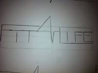
I tried to focus more into the name of the gym 'fit 4 life', the main word being focused on is 'Fit'. I tried to think of visual links to the word, which wasn't as easy as i thought it would be, but eventually through trial and error I thought imagery revolving around a heart monitor would be quite a unique idea,
This also helped me incorporate the '4' into the title without it looking cheesy.
This then allowed me to flow onto the development of this logo which you can see below.
Because of it's shape, I had quite a lot of difficulty finding a solid place for the type to sit around the '4'. As the I want to keep the lines as horizontal as possible to maintain a professional aesthetic for the logo while keeping the heart monitor visuals.
After talking with peers it was decided that the above logo best represented the concept I was going for.
Illustrator Development
I am quite happy with this logo, After, trying various colour options, the green of the heart monitor bleep is the focus of the logo while the text si's around it nicely with the constant flow of the line used throughout 'F' to 'L'


No comments:
Post a Comment