Friday 30 September 2011

Alphabet Soup - "Expand" type development


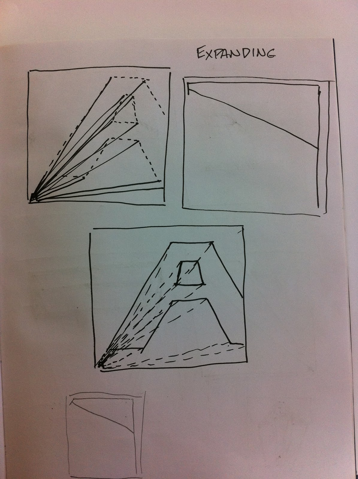
This is the development of my 10 different type face ideas. i found "expand" quite a difficult word to express just using a single letter, However I enjoyed the challenge and I'm happy with some results but others could have more relation with the word. Because of the hand drawn part of the brief I was thinking of quite regimented and measured designs, which allowed me to replicate my ideas into neat 15 x 15 designs.


I used Gil Sans Bold for the existing letter form I used to base my designs on, This is because 
1) Gil Sans is my favorite typeface 
2) The bold element really helped with the "expand" aspect of the brief
3) the shapes of the letters in Gil Sans are quite simple and easier to manipulate.


It is quite clear in many of the designs that I used this font but on others after the manipulation of the letter, it ended up the commonality between the two letters had gone..

I wanted to use the letter "A a", as I believe it has interesting qualities and both the upper and lower case are both so different to each other it would allow me to think of a broader range of ideas and designs. I originally wanted to use the letter "F" but found  it a harder task to manipulate the shape to express "expand".

Wednesday 28 September 2011

How to... "How to deal with the walk to college" Finished map

This is our solution to the problem "How to deal with the walk to college". We gathered information about where the majority of students in our class lived, which resulted in Liberty Park, this is the route we chose to base our map around.
We mixed the idea of the map with the idea of finding obstacles on your journey (as you would in a game) so we wanted to keep it light hearted and a bit silly, as a group we decided to have elements of the map hand drawn and others digitally designed.
The initial idea to display the map was going to be a simple leaflet you could pick up in Liberty Park reception but I looked into the idea of folding the map itself to form an envelope which then can be distributed to each student at Liberty park that will be studying at LCA.

It was the first time I've properly worked in a group on a brief and I think we all worked well together and everyone gave their input, If I was to do this idea again on my own I'm sure I would have come up with a very different result, but I also found working in the group worked fantastically as ideas were always bouncing off all of us.

I feel the idea of the design is a god one but i think the end result of the map ( in my eyes) seems a bit too cluttered and messy but I still think it works well as a piece of design.

Feedback from the presentation
  • We needed to practice our presentation.
  • We could use some of the space of the back for the map to use as advertisement space.
  • The envelope could hold vouchers for some of the shops and cafes on the map.
  • Design separate maps to lead from other halls of residence.


Thursday 22 September 2011

Group crit and anction plan for "How To..." brief

Is the map an appropriate form of delivery? Yes
Is the design to complicated? (not clear)     No, somebody said they enjoyed seeing it
Do you think we have addressed our problem? Yes
Do the colours work well?  Yes, they preferred them to the initial colours before we changed them
Is the route clear?  Yes, they said road names would only add to confusion.

Action Plan:

  • Reduce size of icons
  • add 'zzz' to sleepy man
  • compass bottom right
  • Ask about printing
  • Add descriptions and key

Wednesday 21 September 2011

How to "How to deal with the walk to college" format idea for map.

 An Idea to make the Liberty to LCA map into an envelope to send to lCA students before their arrival to Leeds.


Tuesday 20 September 2011

Monday 19 September 2011

Summer Brief "Alphabet Soup"

This typeface basically revolves around the movement around a drum kit, I have used the snare, and 3 tom's as a template for the entire alphabet, each letter is made up of individual movements from drum to drum to for the 26 letters.
The marks themselves i made using a drum stick and ink which i thought created a nice stroke on the page allowing the lines to go from thick to thin to represent the dynamics and after tones of a drum once it is hit.