Sunday 26 February 2012

Design Practice 1 - Communication is a virus

Chosen message and Initial Ideas
In this brief we have chosen the task of persuading people to tell the truth more, after initial talks with my group we went through various options but decided to focus on lying, this way we could promote telling the truth by discrediting lying, obviously this is not the first time people have tried to make others tell the truth in this way, but as this is a short brief we wanted to get some initial ideas down and make quick decisions so we have a solid idea of the direction of the project from the start.

Also to fulfill the brief and get the message to the public, we wanted a product that would involve the public so the message would be spread, admittedly only to a small percentage.

We decided that we wanted to design some kind of letter/ deposit box where the public will be asked to write lies on a piece of paper and put it in the box, we will try and design the box in a way that discredits lying.


A quick sketch of box shape and dimensions.

Design Practice 1 - Design is about doing posters - Crit Feedback

Issues Raised -

There weren't actually that many issues raised about the posters. There was one main issue that theI wasn't happy about therefore this is what the crit revolved around, and that was,
  • The fact that 2 of the posters only represent England and not the rest of great Britain.
 Action to be taken -

  • For the 2 posters only featuring English representation, add other countries national flower emblems. 
-Scotland - Thistle
-Ireland - Shamrock
-Wales - Daffodil
  • Perhaps merge 2 posters into one, combining puddles and plants each emblem in a random form.
I think that the idea about putting other national flowers is a great idea, I will illustrate the emblems in a similar style I did the rose. This may cause me to adjust the type but I will try a couple of variations and see what looks best.

Friday 24 February 2012

Design Practice 1 - Design is about doing posters - Crit Analysis

Using the technique
  • Describe
  • Interpret
  • Evaluate
  • Theorise
 Describe-
  • Type representing rain
  • Rose- representing England
  • Droplet is Earth
Interpret-

I am trying to not focus on an individual benefit Britain gets from the rain, but instead trying to portrait the country is great thanks to rain and we are proud of it.
The first poster Shows this by having the one of the proud emblems of England, the Rose, growing in the rain that is signified by the type. This message shows the growing capabilities of England as well as representing it's pride and need for the rain.
The second Shows the same emblem but this time representing a puddle in the rain, this shows that England (again represented by the rose) is made of rain and if it wasn't for it, we would not exist as we are today.
The final poster Shows Great Britain sitting on a rain drop as it would planet Earth, this is quite self explanatory what it means especially when accompanied with the type.

Evaluate-

I personally really like the concepts I have produced here, I think they all represent and promote  clearly rain in Britain, I would like to try and incorporate all the countries in great Britain emblems, but i have not had time to solve that problem as of yet, hopefully this will be something i receive from the crit feedback.
I like the layout and design of all my posters, but it seems after gathering peer feedback that the design I like most was not received as well as the other 2 posters, but I suppose that is just personal taste.

Theorise -

I do believe it solves the problem, I think my designs do explain to UK visitors that " so much rain is attractive". They show the pride of Britain and the strength of Britain and explains it is because of so much rain that England is a thriving nation. They are simple messages but I believe they make the point I am trying to make clear. i am looking forward to getting them printed on some nice stock, this will really bring the posters together, giving them a good solid poster feel as well as an off white background for the 2 posters with a plain finish.

Design Practice 1 - Design is about doing poster Final 3 designs before crit

These are the final 3 designs I am taking to the crit, after asking for peer feedback it was decided that these 3 were the most aesthetically pleasing out of the options.


I have a few points that I am not confident about these designs,
one of my worries is the fact that in 2 of my posters i only focus on England and it's national symbol and I don't know if that would fulfill the entire brief, however I will take them to the crit and get some feedback before the actual competition deadline.

Design Practice 1 - Design is about doing poster Development 3


For the 3rd poster, I had no intention of using any of my initial ideas to base it on, I had this idea while I was designing the last poster, I saw the shape of the raindrop and thought it could represent the earth as a planet, I had an idea of putting great Britain onto the raindrop, positioning it so it looks like planet earth.


 There was a brief thought to make the rain drop a character but thought it would be too cliche as i have seen many similar characters in Japanese cartoons such as Pokemon, I also still wanted to continue with the more serious message i tried to portrait in the 2 previous posters.
 In this instance i liked the positioning as it creates a quite clear visual image of the earth. I chose this as the main focus of the poster, as i like the simplicity of the image I don't want to over complicate the design with more colours and images, so I saw this as a good opportunity to incorporate some form of slogan that would feature on the poster.

I came up with a few different options for slogans.
  • Where we feel most at home
  • Rain, the home of Britain
  • Rain is Britain
  • Home is rain
  • Planet Rain, home of Great Britain
I decided to go with the first option of 'where we feel most at home' I realised after placing the type on the poster that i could incorporate the raindrop into the type, which would bring both type and visual elements together.

This made laying out the type quite simple, it worked out well with this slogan, i could use the word 'most' to incorporate the raindrop as a letter. Conveniently it was also generally in the middle of the text when using single word line length.

I played around with a few options and will gather peer feedback to help me decide which layout to pick.

Thursday 23 February 2012

Design Practice 1 - Design is about doing poster Development 2

The second poster that I took onto Illustrator was initially meant to develop into a design based around the sketch you can see below. where a rain droplet transforms in stages into an English rose.


 I wanted to get the right rain drop shape to use in this design as it will be the main factor of the poster so therefore needs to look right to allow rain to be conveyed appropriately.
I am a little worried about this design concept as due to the lack of time I would like to play around with some more sketch ideas of how an individual rain drop could transform into a rose in a gradual and aesthetically pleasing way.
As Illustration is not my strong point I am finishing it quite difficult to illustrate my idea clearly and in a way I would be confident to present on the final poster. Therefore in this case I think I cam going to change the basis of the design.
 I would quite like to stick to the concept 'Britain was built on rain' and as I have used the English rose in the previous design I think sticking with this theme may help the set feel more like a series of posters rather than 3 individual posters.
The colours chosen at the minute have purely been based on water, however, these colours are still linked with the British Royal Navy colours. I quite like the contrast of the tones while it also keeps the design simple. 

At this point, i thought the British link could be incorporated into a puddle shape at the bottom of the poster. I thought I would try a couple of shapes before I decided on the English rose again.
 I tried experimenting with the shape of Britain to see if this would represent the country as well as a puddle.

 As I experimented further I think I just came to the conclusion that it is too complicated of a shape to use as a puddle, and once I tried the English rose option I instantly decided to go with that.


After playing with the shape of the rose and applying the colour scheme to it, the pattern actually worked really well as a puddle, after playing around with the shape I came up with a couple of different options as you can see below, however i think the shape below evokes the imagery of water running down a plug hole instead of a puddle, and in this instance a plug hole could represent showers or non natural forms of running water, which takes away from the element of rain.
I didn't want to include text on this poster, as I don't believe it needs it, I like the simplicity of the message, and don't think type if needed to explain the concept.

Tuesday 21 February 2012

Design Practice 1 - Design is about doing poster Development

I wanted, to take some of my initial sketches and test them on Illustrator to check how I could create the imagery I am aiming for.

 At this point the design is based on the imagery of falling rain, the green back ground has been initially chosen to represent the growing capabilities of Britain thanks to the wet weather.

 This imagery of the falling rain would be a good opportunity to play with type, this type is not an existing typeface, because of the randomness of the shapes of falling rain I feel the type does not have to be perfectly symmetrical when it comes to shape, length and thickness.

 I wnted to mix the type into the pattern of the rain, but as the colours are constant it make legibility quite difficult, and at this point there is no relation to the design and Britain.

 to aid the legibility of the type, I put each letter together, to allow the reader to notice the type immediately, the type due to it's long thin shape still is not the easiest to read, but in this case you cna still read the word and I think it has better aesthetics than the previous randomly place type.

 At this point, I wanted to play with the colours, even though initially I wanted to green background to represent Britains growing capability, maybe in this design it does not suit the concept of the idea.
Changing the type colour to blue helps link the type to falling rain


In this instance I wanted to see what a plain background would look like, personally I think the white of the background suits the shape of the type face but I still think the surrounding rain confuses the design a little.

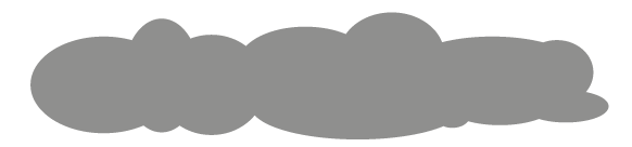
Looking back at my original sketches of the rain type, i believe the use of clouds would link the type even closer to falling rain. As well as creating a focus point for the type to originate from. so I tried a few different twchniques on Illustrator to compare different cloud shapes and colours.


 I didn't want a generic cartoon storm cloud , but instead wanted a unique cloud shape that will help the final layout of the poster.I think having a longer more abstract storm cloud will suit the thin long type better.
 Personally I like this layout below, especially on the plain white back ground, however, I am wanting to rely on some good stock quality for print, maybe choose an off white water colour paper? this will add a nicer creamier finish to the back ground, which will allow the printed version to stand out, as I think if plain white stock was used it may make the design a little bland.
As the poster so far does not link the rain to Britain but just to rain in general I need an aspect that can link the 2 subjects together. My intention at the minute is to use the rain like type to create visuals that make it look like the "rain" is falling to the ground, which again allows me to use the same message as previously intended that 'Britain was built on rain'.
I will try this by taking England's national flower which is the rose, using the rose as a metaphor for England, implying that rain has made England what it is today.

 The Rose was was based on the English rose emblem that you can see above, I took the main aspects and adjusted it to make it unique and more fitting for the poster, as you can see here below.
 As you can see, I have resulted in this poster design,  with the use of a lot of negative space, which I personally think works really well in poster designs, now I have produced the question, 'Is anything else needed to benefit the design?'


I like the poster as it is, but there is an opportunity to involve some type into this piece.
To try this out, I would need an existing typeface, that fit with the style of the poster. In this case I wanted a long thing typeface that had similar aesthetics to the 'rain' type I created.

I found this font online after searching on various websites-

Dunn, Regular 92pt


This typeface had many of the same rain like qualities.

Now to test the typeface layout and colour on the poster these are some of the options I came up with. I will resolve which one to use by asking for peer feedback online and once printed.


These appear to me to be the best options that I came up with, but need some peer feedback before I choose the final design layout.

Monday 20 February 2012

Design Practice 1 - Design is about doing poster brief development

For Idea's behind the 3 A2 posters, I want to try and link visuals that are associated, with rain as well as Britain, a few that come to mind.

rain visuals
  • rain drop
  • umbrella
  • falling rain
  • rain on window
  • puddles
  • wellington boots
  • clouds
  • lightning
  • thunder
  • rain splash
  • ripples
  • plant growth
  • plentiful drinking water
  • flood
Britain visuals
  • Union Jack
  • Queen
  • Tea
  • Swan
  • English Rose
  • Big Ben
  • Houses of Parliament
  • Buckingham palace
  • Royalty
  • Rich tea Biscuits
  • Horse racing
  • Country side
The Brief is for the North of Britain but it does not say on the brief to link the posters to the north of Britain, Therefore this will not just limit the idea's to designs that are only associated with the North.

As this is a short brief it is important for me to get initial designs down earlier, as I have found in previous briefs, if i leave the initial designs too late on a brief this short, it often leaves me less opportunity to develop the ideas to a level I am happy with. In this case I have just quickly sketched out some initial ideas, these were not inspired by research at this point but from the first visual concepts that sprung to mind after the briefing.

I would say these are more of concept sketches than actual visual ideas, i want these to help develop the concept of the idea and the visuals linked with the concept can be adjusted to what most suits.

 Each brief we have been given to date has forced me to end with visuals on my designs that are not consistent with each other, I do not see this as a negative thing as each brief is different and the more "styles" of design you can create the more versatile you will be, however, at the minute I find it difficult to find a starting point when it comes to my designs, and I find most of the ideas develop more when I take them onto the computer, I don't now if this is a good thing, and I want to try and get further with my ideas on paper before developing them further using software.


 This sketch above, was based on the imagery of falling rain, with the slogan in mind, 'Britain was built on it'. This is not promoting an individual positive that rain brings to Britain, but instead focusing on the fact that Britain is one of the most powerful and popular countries  in the world, it has evolved to this state over thousands of years and rain has been a huge factor to the success of the country.
Taking this message and linking it with visuals that are very closely associated with Great Britain (Big Ben and the Houses of Parliament).


I don't know if you can tell what is happening in the sketch above. This was a sketch I played with that see's a rain drop transforming into England's national symbol of the rose. highlighting the point that England's Identity is produced by the rain that we have, therefore without rain our country would not have grown to what it is today.

 As I am interested in typography based visuals, this feels like a good opportunity to play around with the shapes and patterns rain creates in different circumstances. It seems at the minute that many people are playing with similar ideas with each other and due to the quantity of designers entering this live brief I will have to create a concept that will be unique and maybe not so obvious and cliche, (that is the plan anyway).