Tuesday 31 January 2012

Design Principles- Type and Grid

Type and grid forms the basis of most editorial publications.

GRID
Underlying grids are used to base the layout of a DPS (Double Page Spread), Even though a lot of the time in Newspapers and magazines, readers are totally unaware of the underlying grid, this is due to the fact that often the grids are so compact that there ends up being endless variations of layouts, that still fit the underlying grid.

TYPE

Main vocabulary used in Type, originating from original letterpress terms.
  • Kerning - Adjusting the distance between 2 awkwardly fitting letter.
  • DPS - Double Page Spread
  • Ligature - 2 letters that made from 1 piece to avoid kerning
  • Leading - Distance between lines (originated from the days of letterpress when the used to used pieces of lead to put between lines of type to increase the distance)
  • Linefeed - Both the point size and leading added together 
  • Pica - 1 pica is equal to 12 equal parts which are called points,  the size of one point is approximately 0.35mm
  • Measure- is the length of the line.
  • Tracking- is the space between characters, the larger the tracking the bigger distance between between 2 characters.
  • Breakout- Chosen quote that is pulled out and highlighted
  • Reverse Out- pulling white out of a solid background (white text on coloured or black background) the reverse out box is not fitted to the set grid, it is the text within the box that is fit to the grid.
 When measuring type.


Using the Type Measuring tool, above shows the process to go through to work out, the point size of headings and body text as well as being able to work out the leading, adding them together to create the linefeed.


Magazine grid


Measured out grid, of The BBC History magazine, after measuring out the existing grid, i will reduce the scale of the drawn grid by 50 - 75% to create the my own improved magazine layout.

Monday 30 January 2012

Design Process - 100 things poster development

For the posters I wanted to
  • Promote the gym
  • give nutritional/ exercise tips
  • be aesthetically pleasing 
  • remain in an appropriate style for a gym
  • fit with the other products.
The posters will be A3 to ensure they are the appropriate size to fit any where in a gym whether it be in, aerobics room, free weight section, changing room/ toilet etc.

 I want to keep the posters quite simple, making the main focus the type, therefore remaining with a similar colour scheme is necessary, the simple plain black back ground and the figure used in the leaflets will keep everything neutral,
 The aqua blue type on the black and background stands out to viewer as well as linking the poster to the importance of drinking plenty of water.
As well as the figure of the man, the layout of the type keeps the theme with the leaflet front cover.

Also to have another continuous theme I think it would be interesting if the figure was cut out, leaving a man shaped edge to the poster, whilst adapting the poster to whatever surface it is stuck on.

Friday 27 January 2012

Design PrinciplesHot dog book design and development

For my hot dog book I decided to satay with the initial idea of using the photographs of 3 and thry to keep a constant theme and style throughout the book.

I would quite like to incoorporate some type into the book, but in order to keep a theme with the image I was thinking of basing each photo / image as a on a saying or quote that involved the number 3.
  • Third times lucky
  • Two's company, three's a crowed

After re thinking which images I would use for the book, I have decided on the following.


All obviously focusing 3 items being the main feature of the image. I think I will try and use the skills learned in our photoshop workshops, to try and enhance my photographs to give them more texture as well as depth. 

From past work I have found that this also creates a better atmosphere for the type That may be incorporated

The typeface used was found through trial and error, 'Krungthep' is the typeface of the 3 throughout, but the type 'two's company but'  change between Krungthep and Helvetica Bold.

 The designs are quite self explanatory I just played around with my images in photoshop, which infact was so incredibly useful as it has improved my knowledge on photoshop quite a lot, which has given me a little more confidence with this piece of software, it also allowed me to be able to swap between Photoshop and Illustrator, which helped me see how the 2 different pieces of software can be interlinked. 

 After trying a variasion of paper shapes, sizes and thicknesses I have come to the conclusion that I am going to stick to an A4 size oage to make the book, as I want to digitally print I also want to print onto a white/ off white stock, prefereably with some texture but not too much so it will make the ink run once printed.

After a trip to the library i have decided on the antique white paper, which is an off white colour, fold-able thickness with just a nice texture to it.


 My one major problem was my un organisation of printing schedule, I left it too late to book a slot in the digital prints so now I have had to print on my own personal printer, the wuality of print is very good, but unfortunately I was limited to A4 prints only, and even thought my printer does borderless printing (which worked for most print) on some the prints came out a little lopsided, which is a little frustrating as some of them you can still see thin white strips on the prints.

 I am quite happy with the final prints, but obviously would have preferred it is I could have got all of the folds and prints perfect. However after talking to peers and acknowledging their prints I have noticed that many people have had difficulty with these hot dog books. It seems to be notoriously difficult to end up with a book that is perfectly straight. i don't know if this is down to print alignments or paper choices, but maybe a Hot dog book is not the neatest book/ leaflet to design.


 Back Poster                                                                   Front book


 Finished Hot dog 'Two's Company but 3' Books.


.

Tuesday 24 January 2012

Design Process - 100 things leaflet design development

I have had an idea for the leaflet since i created the design development sheets, I wanted to test a 3 way fold out leaflet with a cut out on the front cover revealing an infograph on the inside.

I want each leaflet to help new gym goers understand the importance of their diet as well as teach them how to improve their diet, the leaflets should consist of;
  • explanation of the nutritional value
  • a list of foods containing the nutritional value
  • a sample daily meal plan
  • An infographic explaining the average healthy daily intake of each nutritional value.


Above are some initial quick sketch ideas, one idea was to just have a flyer instead of a full leaflet in the cut out shape of a man with an inforgraph on the front with information about the nutritional value on the back. However this would limit the amount of space I have to fit the information on and considering the amount of text that will be required I don't think this would be a viable option.


 After taking the idea of a figure of a man from the flyer infographic, I could use the same shape in the center of the leaflet with the 2 wings either side folding in. this would allow me to split the male figure and cut out half on each wing. I believe this would create an interesting aesthetic from viewing the closed leaflet, as you would be able to see only the figure of the man, once opened the reader would then be able to see the infographic and read the information.

Mock Up
This mock up I made the leaflet dimensions 280mm W x 120mm H, the folds will be 90 x 140 x 50, I think having an opening that is not in the center will create nicer visuals once printed., it will also allow more space on one side to put any information on the front that may be needed.


 I believe this layout will allow enough room for all the information as well as encorporate the infographic into the design.


Below - illustrator development

 I wanted to create the type so it seemed to be part of the heart rate bar, having the title attached to the logo helps link fit4life to the leaflet, i will use these as the titles for the leaflet.


 When deciding on the body copy I wanted to choose a heavy, bold font which would be more related to the aesthetics of exercise and fitness than any other font style.

The type I chose was Helvetica Neue Condensed Bold

I tried to avoid the folds with the body copy but because I want to keep the leaflet quite small and pocket sized whilst keeping the type a size that is easy to read, some of the type may be running through a fold. To combat this problem I am going to choose a thinner stock to print on, which means the fold will not effect the print and will still be readable once folded out.
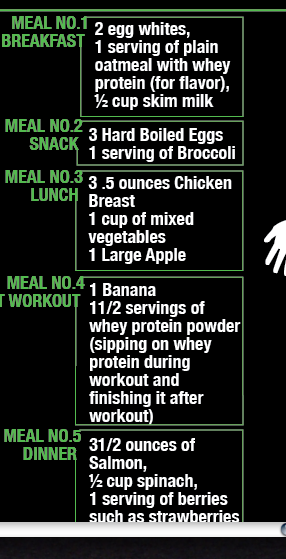
 The text was accumulated from numerous sources which were all mentioned in the research prior to the design stage.
 I chose to bound the body text with a border which links the sub heading to the text as well as creating a border to give the body text a solid shape, the text boxes still continue the theme of the heart monitor.
 For the infographic I wanted to keep the figure 100mm high to allow equal distances for the % increase. each 10% being 10mm, then to show the percentage of that nutritional value to be consumed daily, the area of the graph will be highlighted in green, this will make the graph easier to read that just using a single line.

 To ensure the reader understood what nutritional value was being showin in the graph I placed the title repeatedly down the figure.


 the above screen shot is the finished design for the inside of the leaflet,


For the front and back I just wanted to keep quite simple, to just show the title and lead the reader to the inside of the leaflet.
Using the same font I want to keep the title style constant throughout all of the products, I think this layout of the type suits the space of the cover while remaining bold and gym-like.

 After printing out these rough drafts i can see that the type is very readable and the layout will not effect the readability of the leaflet. I have also taken a trip to find what stock I will use, I want to try to keep it thin and easily foldable, so the stock will not crease badly and damage the print as well as ensuring the leaflet remains closed when folded. I came across, 'Bulk News Print' which I thought was the right thickness for a solid leaflet as well as being easy to fold. The one issue i have is that it may be a little bit of a plain texture and might effect the over all aesthetics. but I will try it ans decide once printed.