Showing posts with label OUGD403. Show all posts
Showing posts with label OUGD403. Show all posts
Sunday, 20 November 2011
Friday, 18 November 2011
alphabet soup/ Workshop Illustrator development
I am still having problems with the same letters but I feel in context they would work well, the only one I think would be a real problem is the 'v' as it is very similar to the 'u' but I have tried various different designs for the 'v' and all apart from this one were quite disappointing visually and would have ended up ruining the aesthetics of the alphabet, but I will continue to try and develop the 'v' while trying to maintain the design concept and theme.
These are the two main 'v' s I came up, I decided to stick with the 'v' on the left but i don't believe it will be my final finished selection.
This is the 'h', 's' and 'z' which I have also been having trouble with, the 'h' is legible but I'm not sure if I like the design, i don't think it fits with the visuals of the remaining alphabet, but if changes were made i fear it would be unidentifiable amongst 'b'.
The 's' and 'z' I really like the shapes, but I am not 100% sure if away from the rest of the alphabet if people would be able to visually recognise what they are.
This is my final print version of my illustrator typeface, after having printed the A1 poster, I realised that i had not mirrored the 'q', which is quite annoying but I have adjusted it now.
Yellow and black were my choices of colour as I felt these 2 worked best for this typeface, the cyan and magenta were just too bold and bright for the feel i wanted, so going with a paler yellow fits the theme I wanted to get.
Certain letters work better than others.
I tried experimenting to see what the typeface would look like in sentence form.
Also after printing I have been developing my 'v' and as you can see from the poster above, it looks much clearer now than the previous.
It still is a little annoying I cant think of a design that doesn't need to be slanted but i believe it fits in better with the typeface and doesn't look out of place when used in the poster above.
Monday, 14 November 2011
Proverbally yours// Mailshot Result after post was delivered.
This result of my mail shot being delivered, however it did arrive with no belly band so obviously that got lost in the post which is a little disappointing as I thought it was quite a tough design, but for improvement, next time i would design it so the belly band was either tighter , OR some how attached to the envelope so it didn't move, but this would not give the freedom to put the belly band back on again, which may be slightly irritating.
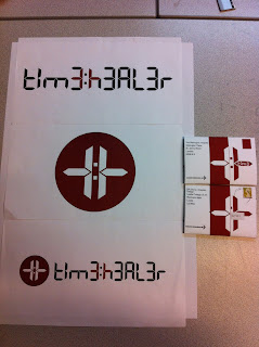
Finished mailshot with finished poster designs.
Finished mailshot with finished poster designs.
Proverbally yours// Mailshot Final designs and crit feedback
My final finished designs for my cancer research, 'Time is a great healer' from a doctors perspective.
I believe the belly bands should hopefully stay on through transit, because I am not fully aware how post is organised, if there are rollers or some mechanical system to organise the post it is possible that it may loosen the belly bound, resulting in it falling off.
Crit Feedback
Overall I got some very positive feedback from both pairs of peers, my message was perceived clearly and they all understood what was being said and agreed it linked well with both my given proverb and occupation.
There was a couple of suggestions for areas that could be changed slightly or improved;
- The mailing list addresses could have been thought about better, (Not all of them) but for example sending the mail shot to Cancer Research UK may be quite redundant, seeming though it was a design for them.
- Another was about the colour choice, which I agree with, maybe blood red wouldn't be an appropriate colour for cancer research, they use mostly blue and pink for there website and logo maybe I could have based the colours on that, but then unfortunately that would loose one of the links to my poster designs if changed. But Blue seems like quite a common colour in the medical industry, so might be a possible change in the design. However, you could argue that the blood red colour links to the 'shock factor' that cancer research usually use on advertisements.
Proverbally yours// Mailshot progress and development
This is my mailing list design, obviously trying to keep the theme going through out, maintaining theme, colour and type. when deciding who to send these mail shots too i researched hospitals/ private care centers/ cancer care units that largely specialise or work in areas that have a strong relationship with cancer research uk, basically anywhere that is either a specialist cancer centre or benefits from funding from cancer research uk. I have decided the people I would mail to are;
1. Cancer Research
Angel Building
407 St. Johns Street
London
EC1V 4AD
2. The Wellington Hospital
Wellington Place
St. Johns Wood
London
MW8 8LE
3. Cancer Centre London
49 Parkside
Wimbledon
London
SN19 5NB
4. LGI
Great George Street
Leeds
West Yorkshire
LS1 3EX
Saturday, 12 November 2011
Proverbally yours// Mailshot progress and development
After research I have found quite an interesting circular folded design that would will be able to see on my design context blog, through development i have found to get a consistent 160mm x 110mm folded format, it would have to make the circle 320mm diameter.
For the sake of mock ups I am just doing the circle at the full capacity of my compass, but unfortunately I will not be able to try out the full sized 320mm layout until I print my final pieces, due to time and money, but once i have desigend the layout I should be able to get a good idea by just scaling the design down so it fits on A3, where as the final piece each one will have to be printed on A2 in order to fit.
The idea of using a round format for my mail shot is to represent the aspect of 'Time" in the design, so the viewer will be able to link the shape to a clock and the images above and below show some examples of ideas playing around with time markings to try and make the link as simple and obvious as possible, while also trying to keep the logo I designed from the previous poster brief to maintain the link between the 2 designs.
I think seeming though my profession and proverb are so closely linked it allows me to keep the theme of my posters and keep a clear link between the two briefs.
After the crit I was still a little confused of what the concept of my design would be about, I knew it would be related to time and the medical profession. However after realising i probably need to do more research on the topic of illnesses and diseases, so i focused my research on this, eventually deciding I would base the design on the 10 most common diseases from 1970 to 2011 to show that not all things are healed by time and possibly link it to some form of charity.
After deciding thins and discovering the problem that maybe it would be a little pointless as a design and wouldn't really benefit anything apart from worrying people, I decided to make the concept more specific in its area. So I think I have finally decided on the idea of making a promotional mail shot for Cancer Research UK and instead of the top 10 diseases I would choose the major different types of fatal cancers and uses it as promotional material aiming to raise money as well as awareness for Cancer Research.
I wanted somewhere to incorporate a cut through on the envelope to reveal the word 'time', but seeming though the envelope and the flier are the same thing then cutting through the front of the envelope will effect the image in the center.
In resolution using my logo from the posters both on the front of the envelope and then in the identical place of the other side would allow me to cut out the shape to reveal the word as well as not having random shapes cut out of the flier.
This design was based on my previous idea of using the major diseases but I just used this for the sake of working out how the mailshot would fold and where would be the best location for certain aspects of the design.
Friday, 11 November 2011
Proverbally yours// Mailshot progress and development
I want to be able to keep my posters and this mail shot linked as close as possible and due to the fact that my proverb 'Time is a great healer' is so closely related to my given profession of a doctor.
Maybe some idea revolving around a prescription pad but i think the paper may be too thin to create a successful professional print.
Also if I design an envelope with some form of cut through design to reveal a certain image of the mail shot inside.
Digital 7
Found these fonts on dafont.com, I believe this type would work well in a design that represents time.
These hand scripted typefaces were the ones I found that had most "Doctor handwriting" characteristics.
This net was just a quick idea to have individual tabs on each end of the 16cm x 11 cm rectangles, but my folding was not accurate and realised half way through that the final rectangle would not be able to have a tab in the smae formation as the rest.
However I was thinking of a similar idea where I would be able to cut an image of a doctors coat or some incorporation of the logo i made in the posters
From initial ideas, the concept of personifying the proverb and my previous poster logo to create a character "Dr. Time" . I want to make this design interesting so maybe some form of cut out or interesting fold would be nice.
After researching in some packaging and paper folding books I have a a few ideas that I could possibly follow Maybe some idea revolving around a prescription pad but i think the paper may be too thin to create a successful professional print.
Also if I design an envelope with some form of cut through design to reveal a certain image of the mail shot inside.
If I was to follow the prescription pad idea I would need some form of hand written script text, OR linking the design with the posters I could continue using a digital typeface, but in the first designs I created the digital type myself and as there will be significantly more text on this mail shot then maybe getting a digital type font would be easier.
Found these fonts on dafont.com, I believe this type would work well in a design that represents time.
These hand scripted typefaces were the ones I found that had most "Doctor handwriting" characteristics.
However I was thinking of a similar idea where I would be able to cut an image of a doctors coat or some incorporation of the logo i made in the posters
Sunday, 30 October 2011
proverbally yours// Posters crit feedback
Overall good feedback with some useful crit information, the main point being the legibility of the text, it seems, initially the typeface is quite difficult to read due to it's digital format with particular confusion of me using '3' instead of 'E' in the text to try and incorporate another aspect of time into the posters, however both peers said that it took them a little while to read it but once they saw it the concept worked well.
I think I will re work my pure type poster as to put the entire proverb on there instead of just 'time:healer' as I think the first and last poster are a little too similar, as well as this ensuring that people can understand the proverbs message fully.
This crit feedback in-particular found that they had al lot of trouble understanding the type and explain they understand the concept but feel the type should be worked on to make it more legible.
Friday, 28 October 2011
Alphabet soup/ Workshop Illustrator development
On going progress with one of my 'Expand' typefaces, I have found I have learnt quite a lot so far on illustrator, but for this project I have found that I only need to use the pen tool, but even just using this has improved general knowledge about various different tools on illustrator.
The 'a' was my original hand drawn example of the typeface, for a majority of the letters so far I have found it quite simple to form the rest of the alphabet using the same design, I have had some trouble with certain letters, such as 'h', 's', 'v' and 'z' taking these letters and managing to make them a legible design which follows the same concept has been quite tricky.
I have also had trouble manipulating certain letters to follow the same size structure, if you look at the x-height, many of the letters without ascenders or descenders are larger than the counters of the letters with ascenders or descenders.
This was due to the adjustment of thickness of each character and if I was to make letters smaller or larger to fit the height of the counters, it would really affect the aesthetics of the entire typeface as a whole, so instead I decided to maintain a height and a width for each certain type of letter.
Subscribe to:
Posts (Atom)


