
Friday 29 March 2013
Thursday 28 March 2013
Responsive // Secret 7" - HAIM - 'Better off' design
The Secret 7" design competition- This year i chose the band HAIM and there single 'Better off' to try and visualise onto a 7" album cover, I have designed covers for albums before but not necessarily to this style of music so that is why I chose it, as well as the fact that it was the one song when I listened to them all that I came up with a concept that I would like to follow.

After listening to the song a good few times, it seems that the rhythm throughout the song produced by the drums, was one of the key elements that gave the song it's unique 'folk / R&B' style.
Being a drummer and a musician myself for many years, I have always thought the shapes and patterns used throughout the theory of music are visually incredibly interesting, so I notated a small (1 bar) element of the main drum groove.

This is where I wanted to personify the notation to relate more to the girls in the band. The song is in 4/4 which means there are 4 beats that must be made up to complete the bar, there are only 3 members of HAIM, all girls and all sisters. the song is also called 'Better off' so by combining all of these factors it resulted in the first 3 beats representing the 3 sisters in the band and the 4th is the element that they are 'Better off' without.
I thought this would be a better way of representing the song, rather than trying to find meaning within the song, because in many cases the song is interpreted differently by every listener.

As the notations still look like music notes I thought it would be more relevant if they did visually look like the heads of girls or at least in some abstract way.
To give the notion of traveling / moving on in life, I thought the textured element that the notes sit on both represent the paper that the notes have been written on as well as the road / path that they are walking along in life.

After making some adjustments, this was the first outcome I produced, which i then took to peers to ask for their feedback and opinion to whether it suits the song and the artist.
the response s I received were mostly about the bland colours of the cover which doesn't really suit the "hipster" nature of the band.


I designed this element all digitally which was probably not the best idea, but sometimes I find it easier to create a rane of different visual concepts on the computer than I do drawing on a sheet of paper.
As the new colours really started to take over the visuals it really didn't suit the textured road/ path I had used in my initial design, I then started playing around with tiling the pattern I had created out of the drum notation to represent the 3 member of the band.

After tiling the pattern I thought it fit well with the visuals and also gave a feel of a large unnoticeable population, which I then separated out 3 of the group to highlight that these are the ones that stand out and are 'Better off' without everybody else.

this is the outcome that I was happy with and the one I chose to submit, I realise the concept is quite abstract but these final visuals created I personally feel suit the song and the "style" of the band.

This brief was practice for me to start working quickly and making informed design decisions, so I finished it in about 3 hours overall, it was nice to be able to work quickly through a piece and I intetend to do more of these quick turn around briefs as I feel this is an area that I fall down on, and usually spend too long making decisions and wasting time instead of just getting on with designing.
Tuesday 26 March 2013
CoP // Publication - Concept
I have decided to base my CoP publication on 'The Psychology of logos' as this relates to the topic which my essay was based on - 'What Creates a successful logo?'. The next stage of the process is to do some more in depth research into the different elements that a designer can take advantage of to psychologically influence a consumer and create some form of emotional bond to the brand.
The 5 key points in my essay that I concluded were the most important factors to creating a successful logo

- Simplicity
- Surprise factor / Cleverness (Hidden visual messages relating to name/ skills of brand)
- Versatility (works on different media and at different scales)
- Originality (unique designs that have not been copied or majorly influenced by brand competitor)
- Message (underlying message of logo, keeps consistent with brands personality and specific target audience)
I want to create a publication that gives a brief overview of the psychological effects that different aspects of logos have on a consumer. It seems that the 3 key elements that can create emotion from a viewer that can also be controlled by the designer are
- Colour
- Shape
- Font
I have sketched out a quick flow chart which hopefully gets accross how I intend to structure the publication and the different headings and sub headings that I will use.


I have actually found preparing flowcharts / some form of graphic really helpful when initially designing a publication, it helps me understand my progress as well as understand the direction i want to project to go in.
It overall gives me a lot more confidence throughout the project.
Monday 25 March 2013
Design Practice 2 // 16 page research book - Vikings Beard Ale
I am quite happy with how the book has come together, I definitely have a lot more knowledge on the direction of where I am going , and how I intend to get there when the next stage of the module starts.
I know this because when we were asked to stand up and present our concepts and research to the class, I was actually surprised with the amount of information that I had learnt over the first period of this module
Saturday 16 March 2013
Responsive // Winston Churchill collab brief - Proposal Presentation Boards
When it came to actually designing the boards, we have decided on producing 6 boards overall, which would work out that 3 would be about the elements I was focusing on and the other 3 fall under Josh's sections, we will be designing them together with a consistent grid to ensure they are visually consistent.
The Grid I came up with for the boards to follow

Completed Boards
The Grid I came up with for the boards to follow

Completed Boards
- Board 1 - Does your Grandad look like Winston Churchill Competition - Explains what the entire proposal of our competition concept
- Board 2 - Introduction to the App and what it is for.
- Board 3 - App navigation flow chart
- Board 4 - Digital Submissions - How to submit entries into the competition
- Board 5 - Promotional Leaflet / Flyer for school kids - What it is for and why it would work as a promotional piece.
- Board 6 - Public Promotional material - how the competition will be promoted outside of school and how it would work to attract the required target audience.
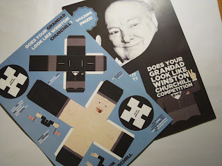
Responsive // Winston Churchill Collab Brief - Promotional leaflet for schools and Mini 3D winston concstruction
Below is Josh's flyer that would be sent to any schools involved, so that each child could have their own and make their own mini Winston while also being introduced to the competition.
The flyer sits on an A4 sheet, the stock would have to be sturdy enough to be able to construct the mini Winston while also still being quite cheap as their would have to be thousands of these printed so it would be a large cost and having an expensive stock would cost far too much.
For the presentation boards we are going to construct the Winston and include a completed photography on one of the boards explaining what the flyer is and why it is necessary for the campaign

The finished Winston came out really nicely, the net that Josh adjusted and created has worked really well and is actually a much better net than the original ones we found to use as a starting point.
Finished Mini 3D Winston


The flyer sits on an A4 sheet, the stock would have to be sturdy enough to be able to construct the mini Winston while also still being quite cheap as their would have to be thousands of these printed so it would be a large cost and having an expensive stock would cost far too much.

For the presentation boards we are going to construct the Winston and include a completed photography on one of the boards explaining what the flyer is and why it is necessary for the campaign

The finished Winston came out really nicely, the net that Josh adjusted and created has worked really well and is actually a much better net than the original ones we found to use as a starting point.
Finished Mini 3D Winston


Thursday 14 March 2013
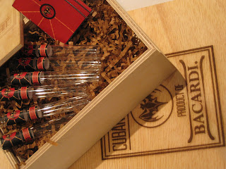
Responsive // Bacardi - Cuban Bacards Presentation Boards
Even though the outcome of the box wasn't to a ridiculously high standard it still allowed me to produce some decent enough product shots to use on the boards, I am very happy with how they have come out considering the mistakes that were made and materials used.
I feel my layout s for presentation boards is also improving, the photography helps a lot, but I think these are the best boards I have produced yet, an i am happy with the visual standard that they were sent.
Responsive // App Navigation and Flowchart
App Navigation - I have tried to split the app down into relevant and necessary sections, so Idealy we have no more than 4 main sections, which would divide further once a certain section is entered.
hopefully this visual now explains itself, both how it will navigate and the user will interact but also why it would be a necessary and important product to help aid this concept.

Initially, We thought we would have a completely separate section for Facts and Information about who Winston Churchill was and what he did, but after sitting down together and taking our concept to a few peers, we came up with the idea (like many other apps) that facts and pieces of Churchill trivia will randomly pop up when the app is on a loading page.
Responsive // Winston Churchill Collab brief - App and concept proposal development
When we took our chosen concept to the mini crit with Fred he made a good point which made both me and josh feel a little more relaxed about our submission. As the brief requires an entire campaign with no real direction apart from the result that is wanted from the target audience. We were both worrying a little of how we would actually work together to create consistent design as well as the fact that neither of us had ever designed an App before.
It turns out that as our proposal is very much conceptually based rather than visually, Fred told us that we should just create the 5 presentation boards to purely get the concept across, rather than worry about the visual outcome of the app and what the final visuals would be. because if the concept is explained well, it would be more likely to be chosen and for the designs and visuals of the campaign to be decided on afterwards.
The boards will still be nicely laid out and consistent.
So considering this, I just want to create some form of visual for the main page of the app so I could thoroughly explain all the aspects that will be involved without having to design every page.
obviously as the brief is to make the face of Winston Famous again, the visuals I will create will be using mostly photographs of Winston.
This photo being black and white, and his face being central was the best choice of the photos I could find.

I wanted to edit the image to give it an aged look, to give the message of historical importance, but this also gave me an opportunity to develop some Photoshop editing skills,

Me and Josh have both decided it would be best to keep everything in patriotic British colours of Red White and Blue, these are also the colours that Churchill insurance use for nearly all their brand identity.
For simplicities sake, all I included was the title of the competition and the explanation would explain what the app has to do with the competition.

I copied a navigation bar style from the National Express Iphone app, to give me a template for the pages that will be included on the app. The Flowchart I have worked out and created that will go on a separate board will explain the full navigation of the App and how it will work as well as how the user would interact with the it.

The button icons were again just designed for simplicity of explanation.

Home

Competition Rules and Instructions

Upload and enter

Winstonize yourself

The name of the app

It turns out that as our proposal is very much conceptually based rather than visually, Fred told us that we should just create the 5 presentation boards to purely get the concept across, rather than worry about the visual outcome of the app and what the final visuals would be. because if the concept is explained well, it would be more likely to be chosen and for the designs and visuals of the campaign to be decided on afterwards.
The boards will still be nicely laid out and consistent.
So considering this, I just want to create some form of visual for the main page of the app so I could thoroughly explain all the aspects that will be involved without having to design every page.
obviously as the brief is to make the face of Winston Famous again, the visuals I will create will be using mostly photographs of Winston.
This photo being black and white, and his face being central was the best choice of the photos I could find.

I wanted to edit the image to give it an aged look, to give the message of historical importance, but this also gave me an opportunity to develop some Photoshop editing skills,

Me and Josh have both decided it would be best to keep everything in patriotic British colours of Red White and Blue, these are also the colours that Churchill insurance use for nearly all their brand identity.
For simplicities sake, all I included was the title of the competition and the explanation would explain what the app has to do with the competition.

I copied a navigation bar style from the National Express Iphone app, to give me a template for the pages that will be included on the app. The Flowchart I have worked out and created that will go on a separate board will explain the full navigation of the App and how it will work as well as how the user would interact with the it.

The button icons were again just designed for simplicity of explanation.

Home
Competition Rules and Instructions
Upload and enter
Winstonize yourself
The name of the app
Wednesday 13 March 2013
Responsive // Bacardi - Finished Cuban Bacard box , bacards and recipe book - Product Shots
Ultimately, considering the problems I had with the laser cutter and other small problems with the materials used to produce this product, I am really happy with the final result that I can submit into the competition, it has been the first piece of work where I have produced a response that I have been really proud of the result.

As you can see the lid lets down the final products visuals,, but hopefully I will be able to remedy this by placing the good laser cut over the to like explained in a previous post.

I am learning the importance of product photography when submitting a piece of work where a product has been created, having some nice, high quality close up shots as well as full product shots with everything nicely laid out can really improve the outcome that you get.


Responsive // Bacardi - Laser Cutting Box Design
I made some slight alterations to the design before I started laser cutting, The box makes the design work more as a peice and I have got some positive feedback after I have added the surounding boxes.
I think it represents both a traditional and modern element to this product which both shows the age and wisdom of Bacardi as Rum brewers as well as a more modern style of sans serif type which appeal to a more modern younger "hipster" audience.

On the test run, on a scrap piece of floppy Ply wood, the outcome was awesome, I loved how the design looked rasterd on it had a really nice dark finish which I though worked really well and linked nicely to the Cuban Cigar aesthetic.


However, Unfortunately, I messed up the printing dimensions on the actually lid, so it came out not centered which is really quite annoying, the wood because it is much harder didn't raster the image nearly as dark as the test piece, so overall I messed up on the final piece, which was upsetting, but I will carry on and see how the product turns out, I intend to cut the test piece to the correct dimensions and the attach it to the lid, to cover my mistake, as well as giving and extra aesthetic quality to the lid.

Responsive // Winston churchil Collab brief - designated tasks
When we started this collab brief, we were asked to fill out a contact with our partner to try and help us decide how we would fairly split the work load while also trying make sure we are each doing elements that play on our individual skills and strengths.
Therefore for this brief we have decided that
Mikey
- App creation proposal - both conceptual and navigational
This is going to be the largest element of the concept
Josh
- Printed promotional leaflet / flyer to be sent to schools around the country which will contain the net of 3D Winston Churchill.
- Other promotional materials such as Billboards, Adshells, projections etc.
As Josh is stronger at illustration then he has been assigned the task of creating the little 3D Winston that will hopefully attract the target audience to the competition and the other elements of the campaign.
Tuesday 12 March 2013
Responsive // Barcardi - Cuban Bacards - Making of box
I took a trip down to the woodwork studio today and talked to one of the engineers about creating a slide top box at the required dimensions, and luckily he was really helpful because I was a little worried if i would be able to physically get the box constructed or just have to propose it. i really want to make the box to learn some new skills, and I now know how to make a slide top box.
I also am glad because now I get to use the laser cutter and learn how that works as it is a tool that I would love to use regularly in design and i have been too intimidated in future briefs but now i am forcing myself to learn skills that are out of my comfort zone.
Once he had explained the easiest way he asked what wood i am wanting to use, as this is a first design i want to keep it cheap in case i make mistakes so i chose Ply wood for now, and to be honest the finish really isn't that bad.
Box dimensions
170mm w x 120 mm H x 50 mm D


Responsive // Winston Churchill collab brief concept - 'Does Your Grandad look like Winston Churchill?' competition
As this brief is aimed at a younger audience and aims to create an educational message about a topic which generally 11- 18 year olds don't really care about. we have decided to propose a competition which we hope will intrigue the audience to get involved as they will have a chance to win a prize. The product range we are going to produce, is a mix of both digital and printed products which will both help promote the competition to as many of the target audience as possible and allow various different methods for the competitor to enter into the competition.
Competition - Does your Grandad look like Winston Churchill?
The problem that needs solving is that many 11 - 18 year olds today have no idea who Winston Churchill was and what he did for Britain and the World.
From one of our original concepts that we came up with 'Winston Churchill Lookalike' which was then supported in the Mini Crit with Abbas and Eve, we thought that the Grandparents of these school kids would be the best source of referencing and information about Who Winston was and what he did.
The Grandad will be a face for the teens to reference and relate to, most people know what their grandad looks like, so by forcing people to link Churchill's face with that of their grandad, it will be more likely for them to remember his face.
Grandparents are another brilliant area to relate to, because even if your Grandad doesn't look like Churchill, it will still create an opportunity for the teens to ask their Grandparents who he was and what he did. We hope that the printed promotional products we propose would promote his face and his name which would encourage anyone who didn't know who he was to ask/ find out.
Tone of Voice
As we have decided from the initial stages of this brief, we have decided to approach this brief with a humorous / comedic tone of voice. This, is much more likely to create interest in a younger target audience who all have different interests and hobbies.
Product range
- Competition - 'Does your Grandad look like Winston Churchill?'
- App - Iphone / Ipad / Android
- Learn competition instructions and rules
- Main way of entering competition
- Addition fun add on app similar to 'Fat booth' / 'Bald booth' where you can turn yourself into Winston Churchill
- Promotional interactive Leaflet/ flyer - Sent out to Schools accross the UK to be situated amongst the students. This culd be given out in specific history lessons, or a mini task that can be done in Form time. It is a fun little task that will both introduce Winston Churchill to the audience as well as explain about the competition and how to enter. The Flyer will contain a net of a cool little 3D Winston Figure that can be made by everyone. This is a fun little creative product which we hope would be the main way of promoting the Competition.
- Range of Printed promotional material - These will be situated throughout town and cities around Britain, in areas where school children / parents regularly visit. These are purely promotion for the competition, to create some intrigue from as many people as possible and help aid he popularity of the app and the competition.
- Billboard
- Add Shell
- Promotional Street Art / Graffiti
Sunday 10 March 2013
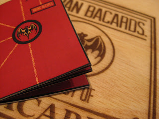
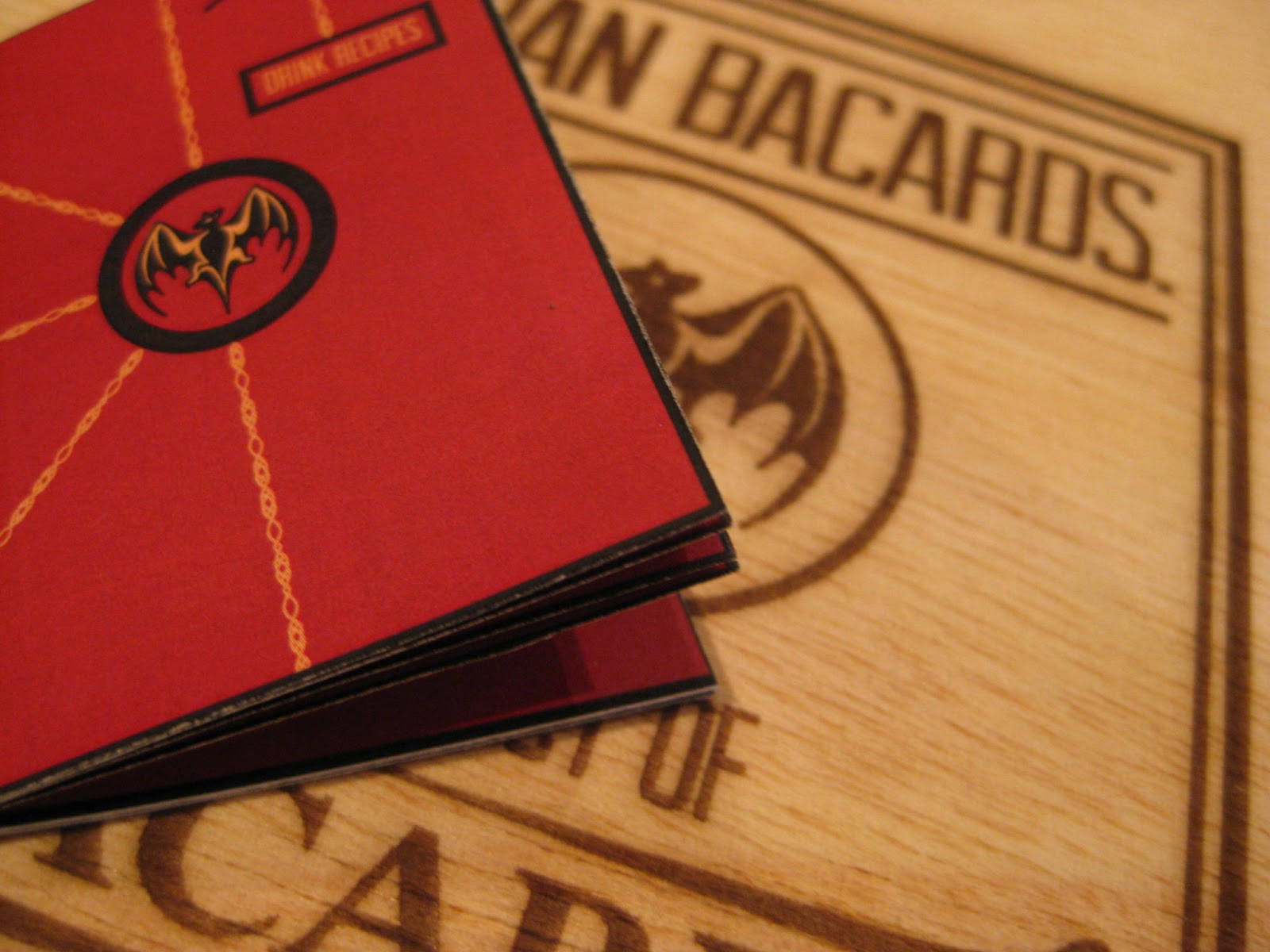
Responsive // Bacardi - Drinks Recipe Menu design
The Recipe book, is going to be designed using the same design as the labels, but initially here were some ideas I produced.

The books dimensions will be 100mm H (the same height as the test tubes) x 50mm wide
So the book is quite small and compact but it will only hold basic information about the drink recipes that are available
As you can see the boolet follows a very similar design path as the labels, using the chains and colour scheme as a basis of design, It is actually a totally different layout that I have not designed with before and I enjoyed giving myself a little more freedom with grid layout for publications, so I am really happy with the outcome


Each DPS consists of one drink recipe with a total of six recipes overall, some which are just mixers and others that are more elaborate Bacardi cocktails.


Subscribe to:
Posts (Atom)