Thursday 28 February 2013

Photography Workshop

 Photography Workshop


This was a really useful session today, to re cap on the element of digital photography that we learnt last year. It is always really nice to get your hands on a DSLR, especially in the manual mode we have been taught adjusting the ISO and shutter speed manually, you can have so much control over how the photo will come out, in relation to the exposure and brightness.


We experimented with various different lenses and different methods of lighting, these all hugely effect the result of the photograph, as you can see even with the regular lens you can take some really accurate macro images. You also have control over which areas are in focus and which are not, this is known as 'Depth perception'.


I decided to try and practice on my own piece of design to see if I could createsome decent photographys for my portoflio, or atleast learn some techniques that will aid my portfolio skills.

Marcus helped give me some tips about how what you should try to do when shooting objects with different textures and finishes.

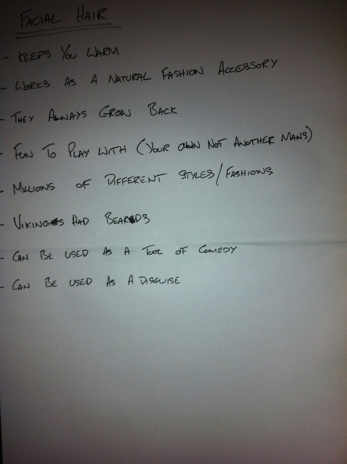
as you can see photograph number 1. looks flat and 2D with the logo and heading onf the cover seeming to have the same texture and finish as the stock it is printed on.

1.   


By using the light as a tool, you can capture the actual finished elements that make the piece what it is. Just by positioning the light to reflect off certain parts and not others gives an accurate portrayal of what materials have been used and how it would look in real life.


2.

I then went onto experiment with the Super macro lens which is huge and quite heavy, but the zoom on it was quite impressive, I am sure it would have been much easier to take some shots with a tripod but for times sake I was just shooting normally.

As you can see (when you can hold the camera steady and get the right shutter speed and exposure) the detail you can get with this lens is amazing and can produce some brilliant close up shots.

You can see every detail and blemish which I quite like in this piece because it gives it a hands made feel which adds personality to the magazine.


This would be a great tool for textiles shooting or anything with a textured finish as you can see on this hat below there can be some really nice shots produced.


I then tried experimenting with a different platform and lighting, I think I need a little more practice with using the ISO and shutter speed settings manually before I can get some really nice portfolio photos but the workshop is a good initial practice phase.


In some cases the photographs could be slightly edited in photoshop,but if you spend a bit of time working out the right settings then you shouldn't need to edit the photographs at all.

These examples below are little too dark I think.


I am happy with how today went as well as how some of the shots came out, I have learnt a lot  and would really like to improve this skill so i can use it confidently in everyday design, i really do like photography and it would make a huge difference to my practice if i could have more control of how the photographs I take come out.

Wednesday 27 February 2013

Responsive // Re Written YCN Brief


Myself and Josh have had a sit down together today after doing a bit of basic research for Winston Churchill, to really try and refine our ideas and re write the brief so it is more specific to us and the tone of voice we are choosing to design with.

We took the technique of highlighting 5 words that help explain each element of the brief.

5 words that sun up the brief.
- Informative
- Educate
- Historical
- Fun/ Entertaining
- Inspiring

Target Audience
- 11 - 16 year olds 
- High school students

Tone of Voice
- Inform / Educate
- Serious message through humorous media

Products that could be produced
- Range of T Shirts
- Packaging for t shirts
- Electronic game
- Churchill Baseball cards (Pokemon)
- Churchill Vs Churchill ( Man vs Dog)
- Churchill look a like (Winston Churchillike)
- Does your Grandad look like Winston Churchill?

Process
- Screen print
- Digital media Video, Web, App
- Photography


Tuesday 26 February 2013

Design Practice 2 // Written Brief and updated research boards

Updated Presentation boards

From the feedback I received today I have updated the boards accordingly in certain areas, I have not put a huge amount of text on but instead directed my research more towards a concept idea rather than just a wide range of possible options.

We had also been asked to right a brief for ourselves which we will then use in the second half of this module.


I have decided to aim my topic towards the drinking aspect of the vikings and create a modern day brand of beer called 'Vikings beard'
I have decided on this area because 1 I would love to be able to design beer bottles and labels as well as the packaging that goes with it, as well as the fact that I will be able to incorporate all the areas I have research into this one design in some way or another so the research I have done in other topics will not go to waste.

I therefore amended the boards to match my newly written brief.


Design Practice 2 // Workshop and research board crit

Todays workshop was split into 2 sections, the first was another 5 words task to help us really refine our topic and intended concept.

5 words 
  • That sum up your good
  • Tone of voice
  • Target audience
  • Process and Finishes
  • Products
The key is to try and be as specific as possible which is much more difficult than you might think, especially with my topic being so broad at this moment in time.

Sum up your good
  • Fun 
  • Rustic
  • Informative
  • Shape
  • Pattern
Tone of voice
  • Comedic/ Humorous
  • Educational
  • Informative
  • Fun for young adults
  • Historical 
Target Audience
  • 18 - 25 year olds
  • Drinkers
  • Male
  • Creatives
  • Action and adventure gamers
Process and Finish
  • Screen Print
  • Embossing
  • Laser Cut
  • Foiling
  • Vacuum mold
  • Textile print
Products
  • Logo/ Brand
  • Beer Bottle / Label
  • Pillow / Game
  • Beer bottle sleeve
  • Beer bottle packaging
  • Packaging for beard grooming kit
  • Mask (with beard)
  • Drinking vessel (pint glass/ horn/ tankard)
  • Comb/ Brush
  • Drinking game 
I also decided that my brief would be focused around 
  • A collection of ...
and the two main design areas I will be basing my product range around will be 
  • Product and Packaging
  • Brand and Identity
The second half of the session was revolved around criting our research boards, the format of this crit didn't really aid the design of my boards as they did rely my explanation along with the visuals in order to get my message across, however we were split into groups and our boards were rotated between 6 people all individually viewing and criting the boards, and as mine have no real direction at this moment in time the feedback I received was rather unanimous .

Feedback overview

Negative
  • Lack of contextual information (all boards)
  • Boards not numbered
  • image alone doesn't explain much
  • Boards are quite vague
I found it quite tricky at this stage to know what to include on these boards, and as I thought that the less text on a board the better then I was designing them with that in mind, I do however agree there should be more structure to the boards, they would need to be simplified if It was only image that was going to be used to portrait my message. however as the crit tomorrow I will have a chance to talk through my boards and present them to the group I think I will keep the boards with no text.


Positive
  • Strong consistent layout
  • Clear headings
  • good range of visuals


Sunday 24 February 2013

Design practice 2 // Viking research Design Boards

OUr task for this weeks session was to produce 5 presentation boards that explain clearly what our topic is, what areas we are researching, who the target audience are, formats we would like to use as well as finishing techniques we would like to incorporate.

At this point in the brief I still have a wide range of interests in the vikings and my research has been quite broad, so for this task I tried to strip it back to the basics.

Board 1

The reasons I chose the vikings as my topic in the first place.

I wanted to get across what are the basic elements I like the most about the vikings, and to be honest it is mostly visual as they were quite a nasty bunch, but they looked awesome as they were massive warriors with huge beards fighting with over sized scary weapons and when they finished they retired and drank large quantities of mead out of a horn.

I then made a board specifically about each of these areas, these would focus on each topic as if it were the chosen topic, starting with contextual and visual research then an example of format in a similar tone of voice as I would like to use in this brief.

Board 2

When focusing on weaponry, I thought the reason they were so good was because of their size shape and uniqueness to any other fighting force at that time, and once I had found the example of Bryan Ku's 'Pillow Fight' collection I couldn't get the idea out of my head and think it would be a quite interesting and knowledgeable concept to follow as it would be totally different to anything I had produced before.


Board 3

The main research around beards was the tools used for grooming at the time rather than the reason behind vikings having beards. So that focused me more towards the grooming aspect when thinking about design format, but then i also wanted to have quite a light hearted approach to whatever I decide to do so looking at the paint brushes and beard heads was more of a tone of voice concept than a design one.

Board 4

Drinking, another of the infamous trait of the vikings. this area however i think gave me the most area of interest out of all of them, I would love the opportunity to design my own beer bottles and packaging which revolves around viking design.


Friday 22 February 2013

Responsive // Jamie Jooste Album Cover

The designs need to remain consistent, so I will be using the same font and colour scheme that was used on the Facebook cover photo, the design also need to remain as simple as possible, while using the photograph again as the sthe main aspect

I started the design process by playing with the photography that I had been given, I wanted to mess around with patterns, to both incorporate solid bright reds while breaking up the photography a little to give the design a broken element.


This cover will be an on going process, and as there is still a few months until the EP is released these are all just ideas to be considered at the minute, so the patterns and options I have developed will be further developed over the next few months.

I used the labels that I created for the banner and adjusted them to incorporate the name of the album and the artists name. the red on its own in this format was far too bold and looked a little out of place, so I used the eraser tool to edit the opacity of the red labels to allow it to blend with the photography better while still incorporating the red into the artwork.


As I am trying to keep the design as simple but visually appealing as possible I started to play around with the placement of the title and the cropped image that I will use for the design.

Below are the final options that I produced and sent to Jamie, at this stage she is happy with the results but we will work on which elements of which design she wants to incorporate, as well as further information / imagery she would like to add.


Thursday 21 February 2013

Type and Grid Workshop // DPS grid and layout task

In this weeks type and grid workshop, we were asked to take away what we had learnt about Van De Graaf, margins, gutters and proportions and apply them to our own DPS design, The main message we were taught today, is that there is not right or wrong answer of where to use a certain grid or what size margins to use it more often comes down to what is needed from the design. 

The eye can be a funny thing, and it takes time usually for the eyes and brain to register where certain elements are on a page, but there are certain areas which seem to be more natural for the eye to look at and without knowing it we would view a page and the layout will either work or it won't.

For my DPS i decided to stick with the Van De Graaf proportions of the center image boxes and just edit the margins as well as splitting the initial box size into 2 and having 2 columns of text underneath each image.

As was explained to us in lesson, more often than not it is more common to have a bigger margin on the bottom and the inside fold, as this is where the spine of the publication would be.

Below is my margin sizing.
 

Even though the margin size has changed, the Van De Graaf technique and image boxes can stay the same size as the actual paper size itself has not been changed.


Once the images have been  dropped and edited in Photoshop you can see that even though the boxes created are not central on the page, far from it in fact, they still look well placed and well proportioned to each other.


Type and grid workshop // Van De Graaf grid system

Using the Van De Graaf grid system to initially grid a page and are a simple way of creating a proportioned layout, the out come will create 2 proportioned text boxes. This is a very simple grid and an additional grid can be placed above to help aid further columns gutters and margins.


This system requires no mathematical measurements so it can allow to you accurately create a proportioned text box on any page size by just drawing straight lines.


As you can see from the outcome, the created text boxes sit really nicely and well proportioned areas and this at least could be used as a starting point to develop a more complex grid


 We got shown a neat little trick to make finding measurements and creating proportioned guide lines, the little square in the corner next to the rulers can be dragged to any point on your artboard, it will make it so that the point you have dragged it to will now act as the 0 on both x and y rulers


if you have a specific area you want dividing you can divide your guides length by putting '/2' in the guide placement  and it splits your second guideline and your 0 starting point by 2 which leave a guideline directly in the center between the 2.


Wednesday 20 February 2013

Typography Workshop - Fibonacci


We were asked after last weeks type session to go away and use the fibonacci sequence to create our own unique paper size,  it seems like it would be easy, but it is quite a tricky one to get your head around, the presentation that was delivered below is the most informative thing i could find on the Fibonacci sequence in relation to paper sizing.


Fibonacci Sequence applied to paper size

I have followed the original example of the Fibonacci sequence but used an original starting size of W 20mm x H 10mm.

0 + 1 = 2
1 + 2 = 3
2 + 3 = 5
3 + 5 = 8
5 + 8 = 13
8 + 13 = 21
13 + 21 = 34
21 + 34 = 55
34 + 55 = 89
55 + 89 = 144


At first I wasn't sure if my calculations were correct when creating my own paper size format, but i think knowing that the spiral works much in the same proportions as the example of Mona Lisa used in the presentation, this is a good tool to check that the proportions you are using are working correctly.


Monday 18 February 2013

Design Practice 2 // what is good?

After the initial workshop I still wasn't too happy with my initial list, so i thought i would spend a little more time and actually trying to think of personal things that i like so i can 

1. Make sure I enjoy the brief and researching the brief.
2. To make sure I end up wit a topic i can work with and end up with a wide product range.


The list could have gone on forever, so for the sake of time management i thought i would leave it where I was and force myself to choose from what I had already got, if necessary i could refine my topic later.


Steve Irwin was my initial thought, and i began to start identifying 10 reasons why I personally think he is good, i then however thought that the topic may be a little too refined and thought i might not enjoy design for this area as  much as I initially thought.


Then beareds and facial hair caught my attention, as I think it may be a topic with many ways of approaching, it seemed like a good option to explore some different approaches.


However then i realised that one of the reasons I like beards so much is because vikings had them. which made me think... Why don't I just choose vikings as my topic?. So I did. 

As we had to gain actual research and facts to back up why our chosen topic was good. I was a little confused when we had to write our good and bad point for our topic as i was writing down reasons why I personally thought vikings were good rather than facts that back up why vikings are good.

In all honesty vikings didn't seem to be that 'good' at all and their daily lives seemed to entail  quite a lot of rape, pillage, looting and murdering.

The list I have produced below is the 10 reasons I personally think they are good, and 10 reasons why they would be bad, I will then take these points and research a specific area about the Vikings to make it a little less broad and then research that specific topic and from that identify facts to back up what was good about the Vikings.


As i said, I would refine my topic area, so I have decided to focus on 'Vikings as Warriors' as my main topic, but i hope to still get influence from other aspects of viking lively hood for the design and development of this brief. 

Below I identified 9 questions that I wanted to find the answers to from valid sources, the answers to these questions qould be the facts that i could use for why the vikings are good.