Wednesday 24 October 2012

Design for Web // Software workshop

Website instant reactions

The average internet user will take about 5 seconds to decide whether they like or don't like a website, therefore when researching websites it is better to give your instant reaction without thinking so you get the reaction anyone would get.


- Simple
- Black
- Minimalist
- Space
- White

This website was designed on inexhibit which is a piece of software where you can design straight onto the internet, many designers use this.


- Busy
- Colourful
- Movement
- Illustration

This website was created on Cargo


- White
- Trendy
- Grid
- Unoriginal 


- Simple
- Circle
- Light
- Waves


- City
- Photography
- Urban
- German

3 Questions you need to answer before designing a website?

What is the purpose of the website?

Who is the target audience

What does the target audience need?

- Research existing designers blogs
- Focus groups  - talk to the target audience and ask them what they want.

Things that you will ALWAYS find on a website


- Navigation bar
- Type
- Image

Limitations of designing a Website
  • Size - Resolution 
- Design to the lowest possible resolution
- PPI for internet based image 72 ppi, but when thinking about modern monitors the new ones are about 226 ppi.
  • Fonts
- When working on the internet you are very limited to the amount of fonts you can use
-as soon as you use a font for a commercial purpose then you will have to pay a license fee
- A list of standard fonts is used, so if fonts are not accessible from a certain computer you can choose several different fonts for it to change to so you always have control of what is being seen. instead of default Times Roman being used

- You can download a web kit where it will download a font actually onto the website, so you would then be able to use custom fonts instead of the limited default fonts.
  • Colour
- RGB is the standard colour mode for design for web, every monitor/ computer has slight variations of RGB therefore colours will be different on every monitor.
- Using a hexadecimal colour code which is the limited amount of colours that can be used for web, each colour will come with its own code which will be used when making the website for example #cc3333 being a light maroon colour.


Useful publications for web design

- HTML and CSS - Design and Build Websites


Language in web

  • HTML - Hyper Text Markup Language
  • CSS - Cascading Style Sheets
  • WYSIWYG - What You See Is What You Get
  • URL - Uniform Resource Locator
  • FTP - File Transfer Protocol
  • CMS - Content Management System

2 things you must purchase when you design a website 

- The domain name
- The  space that you are using on the server that is hosting

Creating a Scamp

Dimensions - 1024 x 768

Design for Web // What a website is/ needs

What is the purpose of a website?

These are the obvious reasons that people would have / use a website
  • Promotion
  • Informing
  • Persuasion
  • Contact
  • (Entertainment)
The audience of a website is
  • NEVER EVERYONE
3 main things a website should have
  • Useability
  • Functionality
  • Aesthetics 
When Considering the design of the website you need to
  •  Start designing on page NOT on screen 

What does a website need? 


 A website generally should consist of 4 /5 pages 
  • Landing page
- Why? What's the point?

  • Home Page 
- Grab Attention
- Could have running news page on your homepage a little like a blog

- Put what you want on it but you need to make it interesting
- Most important page on the website 
  • Contact Page  
- Business address or some address for contact
- Email
- Phone
- Twitter

-Possible to just have a footer on all pages / home page so contacts could be accessed all the time  
  • About Page 
- Info about career history and education
- Your interests in design
- Your skills and specialties 
  • CV
- is it needed? too much like About page 
- Most clients wont care
  • Portfolio 
- don't split the portfolio page into sections (typography, editorial etc...) as this will limit the amount of work you will seem to have 
  • Shop
- If you produce your own products

  • Blog
- Blog of design interests
- Could incorporate blog onto home h=page, maybe turn it into a news page 

  • Fees
- Not needed really
- Can adjust fees as necessary
- Would work better on a printing website


After quickly creating our simple Home page layout we all went round on a quick crit so we all got some positive and negative feedback.
Here are some of the main points that kept on being raised throughout the group
  • Clean Layout but unoriginal
  • Navigation
  • Redundant features
  • Kiss (Keep it simple stupid)
  • Grids

Tuesday 23 October 2012

Design for print // Print workshop, how to produce a booklet publication

We are going to be looking at a simple book design which will be bound by Saddle Stitch, We will be producing this on Indesign and the initial document setup should look like this


  When working in Indesign the layout of each DPS will be see as you will view it in the book, this is called a 'readers spread', this allows you to design the book as you would see it.

The actual book will be printed out in a different order, this is called a 'printers spread' this is the order it will be printed out, but when the book is bound the pages will again appear in the correct order.

Indesign automatically prints in the 'printers spread' but there is a way you can work out what pages will be printed together.

Page 1

8-1      front
2-7      back

Page 2
6-3     front
4-5     back

Using the Master page 


you can place page numbers by creating a text box on one master page and then follow the process below


This then automatically adds each pages number to that specific page.


you then copy the first master page and drag it onto the second master page and this will complete the remaining pages on the right hand side


If you want the page numbering to start on a page which isn't the first then you can go into the pages options on the page where you want the numbering to start


Then choose the roman numerals other wise it will not work as then you would have 2 page number 1's 

Whe ready to print you must ensure that you create the right settings as you can see below


 General settings

Setup, you must remember that when you use bleed on this publication you need to accomodate it when you choose what size paper you are going to print onto.


Postscript file is the language that is converted to print. it is also possible to use this as a font.
once this option is chosen it will give you an option of the printers that are available to use


Depending on which printer is chosen it will limit your print to the maximum page size possible to print on that specific printer.


By choosing the Adobe PDF option you will be able to print any size up to A0, this will allow you to print any size you like but it will save the file as a PS (PostScript) instead of a hard copy print, this will open just as a PDF would.

Uploading a PDF onto Issuu


You will always want to save your PDF on Indesign at the lowest file size as possible, you do not need a print quality PDF for this.

Once you have uploaded your pdf onto Issuu you are then able to embed your issuu publication on blogger or other websites/ blogs


you do this by just copy and pasting the embed code onto blogger or any other website you want to link it to.


Wednesday 17 October 2012

Design for print // Print workshop - Indesign group

In this workshop we were given an Indesign file that has been sent to print, we were told there were 8 mistakes that needed to be corrected before the document could be printed.

We had to go through and find the mistakes , Identify them and work out how we would fix the problem.

This process is called 'Pre Flight' checks.

All information about each image that is used in a file can be found in the 'link' pallet of Indesign.
Mistakes

- Tree Silhouette image is missing from the links. To solve this we would have to make sure that all of the images are in the folder where the links are from. In this case, the file has been misplaced


- PANTONE 341 C GREEN and PANTONE 7426 C RED are being shown in the separations  and watch palette but not being used in the publication. This means we have to delete these colours in order to clean out our palette and avoid expensive prints in future. This also brings us to our 5 ink allowance.

-  Some of the photos are only 15% of there original size and need to be saved to actual size before bringing them into Indesign.


- Bottom image is only 72DPI and it should be at least 300DPI


- One image is RGB colour mode and all of them need to be CMYK in order to work in the colour mode of the Indesign document.


- Colours need to be extended to the bleed line.


-  Registration colour has been applied to the text at the bottom of the page instead of black.

-  The text at the bottom of the page is red when looking into 'Ink Limit' which means it might smudge or bleed because there is too much ink overlaid on top of each other.


- One of the swatches in the swatch pallet is RGB, by changing this global swatch it will adjust all of the elements which use that swatch colour. 


Tuesday 16 October 2012

Design for Print // Indesign Workshop


In this session we are looking at designing for print when using Indesign, using colour. Indesign will generally be the last piece of software used out of all the Adobe creative suites to bring it all together, therefore there are elements that are needed to know before sending a product to print.

Indesign should be the piece of Software used when combining image and text for print, it is the only piece of software really that can be used to produce multiple page documents.


When creating a New document you will find that you will never use the new 'Book' option as this is a choice if you are wanting to create a more complicated lengthy book design.

Page Size - should always be the size of the completed finished, printed page size, not the A format paper size that it will fit into.


Columns & Margins - Should only be used if needed, they will not be printed onto the sheet,  but will help guide you depending on the project you are working on.


Bleed - Bleed ensures that colour is printed to the very edge of printable area, this will help with double sided prints.

The bleed amount should be discussed with a printer first to ensure both parties know what is meant to be printed.

Slug - Slug shows the elements that will be printed outside the final page size, trim marks, crop marks etc, once this part of the page is cut to size, all these 'slug' elements will be lost when the page is trimmed.

Pages - any product that is being created that is in the form of a multiple page booklet, then facing pages should be used, however if you are just working on a single page format then you should not check 'facing pages'

Primary Text Frame - is a button you will check to place a consistant text box which are the size of your column width, this is useful if you are creating a publication with a lot of text so you can continue from page to page.


The page below is the layout of the page you will get if you create a new document.

Pink line - is the margin / Gutter line to show the edge of a column
Red line - is your bleed area
Light blue - is the Slug are
Black line - the edge of actual paper size.

Below shows the layout of the pages in order, each of these apages is a Master Page template, this means anything that you put onto your master page will be repeated throughout the book, this is usefu for page nmbers or continuous imagery, you can edit either master page at the top of the tab where it says 'A-Master'  and this will edit each page that it applies to.

An example below
As you can see, by editing the left hand page on the master page then it repeats it on every left hand page throughout the publication, you will not be able to adjust the master page element on each individual page. If you want to do this hold Command & Shift and click on the specific page, you will be able to adjust that individual element on that individual page.

There can be endless master pages added throughout the book, if you were creating a magazine with 3 different layouts throughout different parts of the publication, then you can add 2 more master pages and edit them accordingly, this in turn helps you remain to be consistent and accurate with your repeated layouts.

Applying and printing Colour in Indesign 

The application of colour works in the same way on Indesign as it does in both Illustrator and Photoshop, a vector shape is needed and you can use both fill and stroke to fill specific colours to fill your vector as needed.

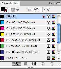
The methods of picking colours are the same aswell there are Colour Pickers - Colour Guide and Colour Swatches.

We will be using Colour Swatches again as it is the best for print.


It is pretty much identical to the Illustrator Swatches tab and all the elements remain the same.

This allows quick and consistent colours in one document, so you can colour both text and vector images.

Adding new colour swatches is again exactly the same as Illustrator, you can adjust your own CMYK colours and add when you get the one you like OR you can again use Pantone spot colours in the same way again.


Adding new Tint swatches is again done in a similar way as you can see below, this is a good technique to keep all tints of the same colour together so nothing is lost / confused.


What elements you should check on you Photoshop files before importing into Indesign
  • CMYK or Greyscale
  • 300 dpi
  • Actual size needed (don't adjust size in Indesign)
  • PSD (transparent background) or TIFF
What elements you should check on you Illustrator files before importing into Indesign
  • CMYK
  • .AI format or Copy and Paste
  • You can scale illustrator artwork on Indesign

When placing a PSD file which consists of 2 colours, it will automatically add the 2 pantone colours used onto the colour swatches tab.


When importing Illustrator files, you can either place an image like you would with Photoshop, but you can also Copy and Paste and illustrator vector, it will paste the vector into Indesign as well as place both spot colours into the swatches panel.


When importing Greyscale Tiff files, it will import the image as black on the swatches panel, if you select the actual image by clicking the center circles of the image then you can pick any other coloured swatch and this will then apply a monotone effect, this is useful if you are choosing spot colours inside Indesign


 as you can see below the image has changed its spot colour but still keeps its gradient of tone.


If you want to edit an image that has been imported into Indesign from another adobe creative suite you can select that individual image, go to file - Edit with and you can choose the software of your choice.

A shortcut to do this is Alt - Double click on image and this should open up automatically.


You can edit the image in Photoshop which I have done below and then just save the image it will then automatically change on your indesign file, if you have got a tiff like this image is below if you want to make it transparent you do the same process but save it as a PSD file and this will allow the image to remain transparent in Indesign.


this can allow you to create some interesting layouts , designs and colour using all 3 pieces of software.
To help with various types of print like Litho / Screen print, you can separately preview individual sections of a piece that that are all one colour.


 This panel is very similar to swatches panel, but each colour now shows a view option, if you turn off everything but one of the CMYK colours you will notice the Indesign layout will only show the aspects on screen that are made out of that specific colour, this can help with exposing individual screens for screen print.


As you can see below these show each separate plate that will be needed for each CMYK


 You must also ensure that you delete all the un-used colours from the swatches pallet before you send your work off to the printers, as if done this way unwanted colours could be incorporated into a. print.

This is a benefit if only using a limited number of spot colours