
Showing posts with label PRD. Show all posts
Showing posts with label PRD. Show all posts
Tuesday, 21 May 2013
Monday, 20 May 2013
Design Practice 2 // Viking Beard Ale - Final product shots
The products that I have ended up with would obviously never survive the real world of manufacturing and retail, but I think I have produced a nice start at least to propose some of the elements, for example the Bottle opener / necklace would come in the colours and shape I have use but would obviously have to be made out of steel.
I am really happy with my final products to be honest, I was a little worried towards the end that it wouldn't end up the way I had initially planned but overall I am really pleased with my branding effort as well as the production of the final pieces.


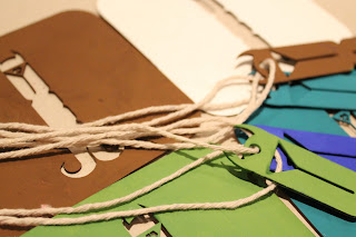


I am really happy with my final products to be honest, I was a little worried towards the end that it wouldn't end up the way I had initially planned but overall I am really pleased with my branding effort as well as the production of the final pieces.


Design Practice 2 // Viking Beard Ale Personalities publication
This publication is pretty much just for another visual element, it could have contained information about each different personality, maybe and explanation of the taste or the type of personality the beer suits, but as there is no actual beer company at the minute I thought it would be pointless studying up and writing descriptions of beers that don't even exist but never the less I this this nice little booklet just helps the consumer gain a sense of what each personality is about.
It also gives a good format to display some nice product shots and photography however some of the photography in the publication was not taken by me.
It also gives a good format to display some nice product shots and photography however some of the photography in the publication was not taken by me.
Saturday, 18 May 2013
Design Practice 2 // Possible way of displaying product in shops
As one of the concepts would be to give away a free beer mat with any purchase of VBA, and considering for my proposal I used the negative cuts from the beer mats to form the label for the bottles, technically the coaster could be slotted back over the logo, so it is attached to the bottle, so when people purchase a beer they can just pull the coaster off, the label remains where it is and the coaster can be used with the design cut from the center.

I think this would create a unique visual appeal to the beer and in some cases people may just purchase the beer just because you get a free boaster, and when you peal the coaster away and the design is still attached to the bottle i think that is a cool and interesting design aspect.


I think this would create a unique visual appeal to the beer and in some cases people may just purchase the beer just because you get a free boaster, and when you peal the coaster away and the design is still attached to the bottle i think that is a cool and interesting design aspect.


Thursday, 16 May 2013
Design Practice 2 // Bottle Label production
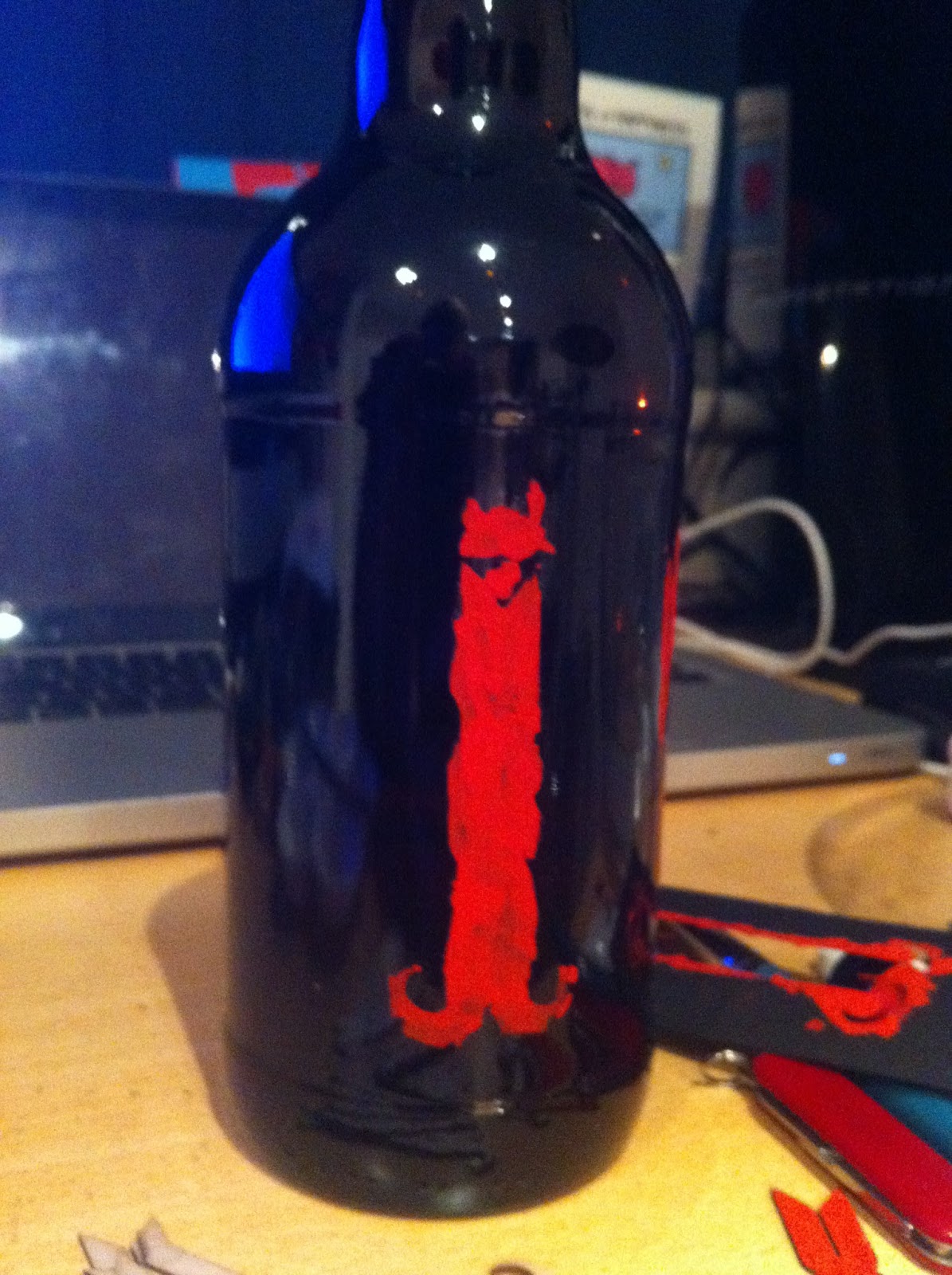
My original idea for the production of the bottle labels was to get individual labels printed onto vinyle stickers and cut on the cinyl cutter, however after considering this I would have problems as the vinyle stickers once printed and stuck on have either a transparent or white back ground which if transparent would cause the logo to be too dark on the bottle and now be seen, or each logo would have white backround which visually wouldnt be that appealing.
Therefore i then decided I would cut the design out on the laser cutter and use the stencil created to paint the design onto the bottle,


As you can see, as the stencil doesn't include the bowls of the B and because the stencil wouldn't stay flush with the bottle, the result of using paint and a stencil didn't really come out that well, so I had to re think how I was going to produce these labels. For the sake of the design I just want to create a representation of how the label would look rather than creating the completed article that is water proof and damage proof.
I tried to use the negative element of the laser cut to use it as a stamp, to see if that way of transferring the image would work, however as the glass is a glossy surface and the paint it wet, the stencil just slipped around on the bottles surface so no clear image was transferred.


I was getting a little worried at this point that i was going to have to completely re think how I was going to produce these bottles, and as time is running out until the deadline i could really do with getting this production stage out of the way.
However, from laser cutting the Beer mats I was left with the negative mountboard cut outs. So I saw the opportunity to use these as the label representation, they also give a really interesting 3D effect which I personally think looks really nice. I mixed the 6 colour out of Gouache paint and painted each logo it's own individual personalities colour, the effect of using gouache pain creates a clear bright and vibrant range of colours which look great as a set.

For now I have just attached the mountboard labels with double sided sticky tape, as non of the glues I have used stick the label to the glass. but for now I think they give a good looking representation of my intentions for the bottle visuals.


Therefore i then decided I would cut the design out on the laser cutter and use the stencil created to paint the design onto the bottle,


As you can see, as the stencil doesn't include the bowls of the B and because the stencil wouldn't stay flush with the bottle, the result of using paint and a stencil didn't really come out that well, so I had to re think how I was going to produce these labels. For the sake of the design I just want to create a representation of how the label would look rather than creating the completed article that is water proof and damage proof.
I tried to use the negative element of the laser cut to use it as a stamp, to see if that way of transferring the image would work, however as the glass is a glossy surface and the paint it wet, the stencil just slipped around on the bottles surface so no clear image was transferred.

I was getting a little worried at this point that i was going to have to completely re think how I was going to produce these bottles, and as time is running out until the deadline i could really do with getting this production stage out of the way.
However, from laser cutting the Beer mats I was left with the negative mountboard cut outs. So I saw the opportunity to use these as the label representation, they also give a really interesting 3D effect which I personally think looks really nice. I mixed the 6 colour out of Gouache paint and painted each logo it's own individual personalities colour, the effect of using gouache pain creates a clear bright and vibrant range of colours which look great as a set.

For now I have just attached the mountboard labels with double sided sticky tape, as non of the glues I have used stick the label to the glass. but for now I think they give a good looking representation of my intentions for the bottle visuals.


Design Practice 2 // Necklace / Bottle Opener design and Production
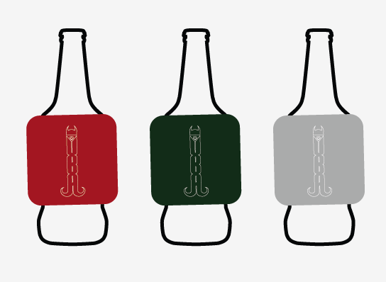
One of my main aims was to create a bottle opener which both worked and linked to the visuals I have created for the brand, Having spent a long time developing the logo and working out that by adjusting the logo shape i could utilize it as both a logo and a proposed bottle opener.

I altered the design slightly to attach the helmet to the beard, and incorporated a whole to attach the necklace / handle element, I suggested that it is both a necklace and a bottle opener as I feel many people may use it as a fashion accessorise as rustic style , string made necklaces are a hipster fashion at the minute, but it's main function would be a bottle opener, bar tenders could wear it round their neck while they work, which promotes the beer and shows the brands versatility.
 As I very much doubt I will have enough time to make an actual metal version of this bottle opener, I will again use the same mount board i used for the Beer mats, just to propose how they would look and work as a set.

Once cut out I again matched a bottle opener to each colour so they could either work as a consistent set or people could mix and match colours depending on their preference.

As you can see below, the bottle opener would come attached to the bottle which with the string I have chosen adds another rustic element to the design which again links well to the Viking way of life. or they can be given out separately with purchases or bought from hipster stores around the UK.


Below is an example of how it would work as a bottle opener, currently being made out of mount board it doesn't actually work, but it would if a metal version was created.


I altered the design slightly to attach the helmet to the beard, and incorporated a whole to attach the necklace / handle element, I suggested that it is both a necklace and a bottle opener as I feel many people may use it as a fashion accessorise as rustic style , string made necklaces are a hipster fashion at the minute, but it's main function would be a bottle opener, bar tenders could wear it round their neck while they work, which promotes the beer and shows the brands versatility.


Once cut out I again matched a bottle opener to each colour so they could either work as a consistent set or people could mix and match colours depending on their preference.

As you can see below, the bottle opener would come attached to the bottle which with the string I have chosen adds another rustic element to the design which again links well to the Viking way of life. or they can be given out separately with purchases or bought from hipster stores around the UK.


Below is an example of how it would work as a bottle opener, currently being made out of mount board it doesn't actually work, but it would if a metal version was created.

Wednesday, 15 May 2013
Design Practice 2 // Beer Mat Production
Most of the products I am producing will be created out of designs cut out of the required material on the laser cutter, and painted by hand to the required specification.
Therefore I wanted a good solid material to use for the beer mats as they need to be light weight but durable so a solid thick card such as mount board would be a good option, I got a stone coloured board so that when I paint the coasters they will have a nice vibrant colour which won't be dulled by a darker material, however with Gouache paint i think it paints with the same intensity on any colour back ground.
 After laser cutting the beer mats, I had to re mix the existing colours that I had used for the bottle labels, which in hind sight I should have produced them all at once to allow me to use the same paint for each product. However I think i did a pretty good job of colour mixing and matching and the results I am quite happy with. I have never seen a beer mat similar to these so it would grab my attention, especially with the broad range of eye catching colours that have been used.

A fun promotional tool that can be distributed around bars, pubs and clubs in student and young professional environments, they can also be given away with beer purchases, so it would be a wide spread promotion.

As a set, the colour scheme works nicely together, these colour be sold as a separate product, in supermarkets, bottle shops or perhaps in hipster stores such as Urban Outfitters or TopMan which would be another way of distributing and promoting Viking Beard ale to the required target audience.

Therefore I wanted a good solid material to use for the beer mats as they need to be light weight but durable so a solid thick card such as mount board would be a good option, I got a stone coloured board so that when I paint the coasters they will have a nice vibrant colour which won't be dulled by a darker material, however with Gouache paint i think it paints with the same intensity on any colour back ground.


A fun promotional tool that can be distributed around bars, pubs and clubs in student and young professional environments, they can also be given away with beer purchases, so it would be a wide spread promotion.

As a set, the colour scheme works nicely together, these colour be sold as a separate product, in supermarkets, bottle shops or perhaps in hipster stores such as Urban Outfitters or TopMan which would be another way of distributing and promoting Viking Beard ale to the required target audience.

Monday, 13 May 2013
Design Practice 2 // Beer bottle design and products to be sold with every 6 beer bought
THe Consumer has a choice of what beers they would like to purchase, there is an individual price of each bottle, then there is a price for 3 and a price for 6, all reduced each stage, if the consumer decides to purchase 6 beers they have the choise so they can purcase one of each personality, all the same one or mix and match depending on their preference.
if the 6 bottle option is chosen then the customer would receive a free promotional beer mat and bottle opener / necklace of their choice. These small cheap promotional products will also help place a part at beer festivals or free hand outs in student unions or promotional venues to introduce the target audience to the new product that is available for them.


if the 6 bottle option is chosen then the customer would receive a free promotional beer mat and bottle opener / necklace of their choice. These small cheap promotional products will also help place a part at beer festivals or free hand outs in student unions or promotional venues to introduce the target audience to the new product that is available for them.


Sunday, 12 May 2013
Design Practice 2 // 'What's your Viking Personality?' initial page layout
I am planning on creating an A4 publication that will accompany any bought drinks, to visualise each different Viking Beard personality. If the drinks were to be individually brewed, this book would contain taste and beverage consumption information, as well as a small background story of the vVikings that this specific beverage is based upon.
I am hoping that by creating this is would not only give the customer and nicely produced good looking visual publication but it would also help them decide which Viking personality suits them best.
This Publication could be distributed to bars, clubs and pubs that contain large quanities of young 18 - 25 year old males. as an introduction to the drink before it is released, so people can already decide what personality of VBA suits them best.
THese are some initial mock ups of the page layouts and the photography I will use to represent each beverage "personality"
Saturday, 11 May 2013
Design Practice 2 // Concept development
When I wrote the this brief I stated that there should be 6 different bottle label designs, I have been trying to wrap my brain around how I would keep the designs consistent while also clearly representing them as individuals.
Then I thought about what colour scheme I should use and by linking the two thoughts i have developed a new idea that VBA could follow, by attaching 6 different colours to 6 different drinks by VBA this could give each drink a different "personality", each one brewed differently so that when people first try the drink they will have more excuses to try different flavors to see which one they like best, and this would mean what ever is their favorite drink is their Viking personality.
This could go much further in different ways, each personality of drink could have different back stories or old viking legend linked to them, each personality could have it's own moto or emblem, the products that would be created for each beer could be used as collectors items, so people can try and collect all the bottle openers for example.

Friday, 10 May 2013
Design Practice 2 // Viking Beard Ale Label Design Idea
My plan for the Label design is to keep it as simple as possible and as you will see on my Context blog i have highlighted several designs I would like to use as inspiration, a simple logo cut out on the vinyl cutter would work perfectly, I really like it in label designs when the design is not just average but it is a unique shape of uses the shape of the bottle of the colour of the beer as a design tool, that is what I aim to do.

I think the simpler the design the more recognisable the product will be, I have to remember that the point of this branding is to attract a younger male audience to Ale as it is currently see nas an older man drink and this shouldn't be the case. Therefore the design of this bottle should not follow existing also brand designs but should be attractive and in fashion enough to attract a young professional and student audience.


I think the simpler the design the more recognisable the product will be, I have to remember that the point of this branding is to attract a younger male audience to Ale as it is currently see nas an older man drink and this shouldn't be the case. Therefore the design of this bottle should not follow existing also brand designs but should be attractive and in fashion enough to attract a young professional and student audience.

Thursday, 9 May 2013
Design Practice 2 // Logo Feedback and alterations
i took the my logo to a group of peers today to get their individual reactions to what I had created, there was a lot of initial positive reactions, and the letters formed from the platted pattern on the beard grabbed a lot of peoples attention, however there was one peice of consistent constructive feedback that I had received from a number of people, and that was perhaps the hape at the bottom of the beard could be 'more beard like' perhaps the A could form into two plats. it would also benefit the logo I think if it were more symmetrical.
 I therefore messed around with a nother couple of ideas .
Firs the plat I dea, which I actually found quite difficult to accurately represent them in a way that fitted with the existing shape of the 'A' so I wasn't a fan of this final outcome I thought if I can create nothing else I could come back to this idea at a later stage to try and re think how it would work, but for now I am just going to move on to the next idea.

I then created this piece below, by shaping the logo in this way it not only shapes the logo as a Viking beard but it symmetrical and if this shape was formed out of metal it could be used and sold as a bottle opener which is a perfect product to be linked with the brand.

I took the new ideas to get some more feedback from peers and everybody quite clearly chose the most recent design that could also be used as a bottle opener.
Subscribe to:
Posts (Atom)