Sunday 30 October 2011

Design Principles - Frankenstein Typeface

Single original typefaces produced using individual sections of chosen existing type faces.
By deconstructing original type faces, we were asked to produce a range of letter options that use the same elements of the original typeface but still create extremely original letterforms, below are some of my results.

It actually surprised me how much you could do with certain typefaces, depending where you deconstruct the letter depends on the final outcome of the new letter, and it was quite easy to come up with some interesting shaped letters that may not even have crossed your mind when you first started.


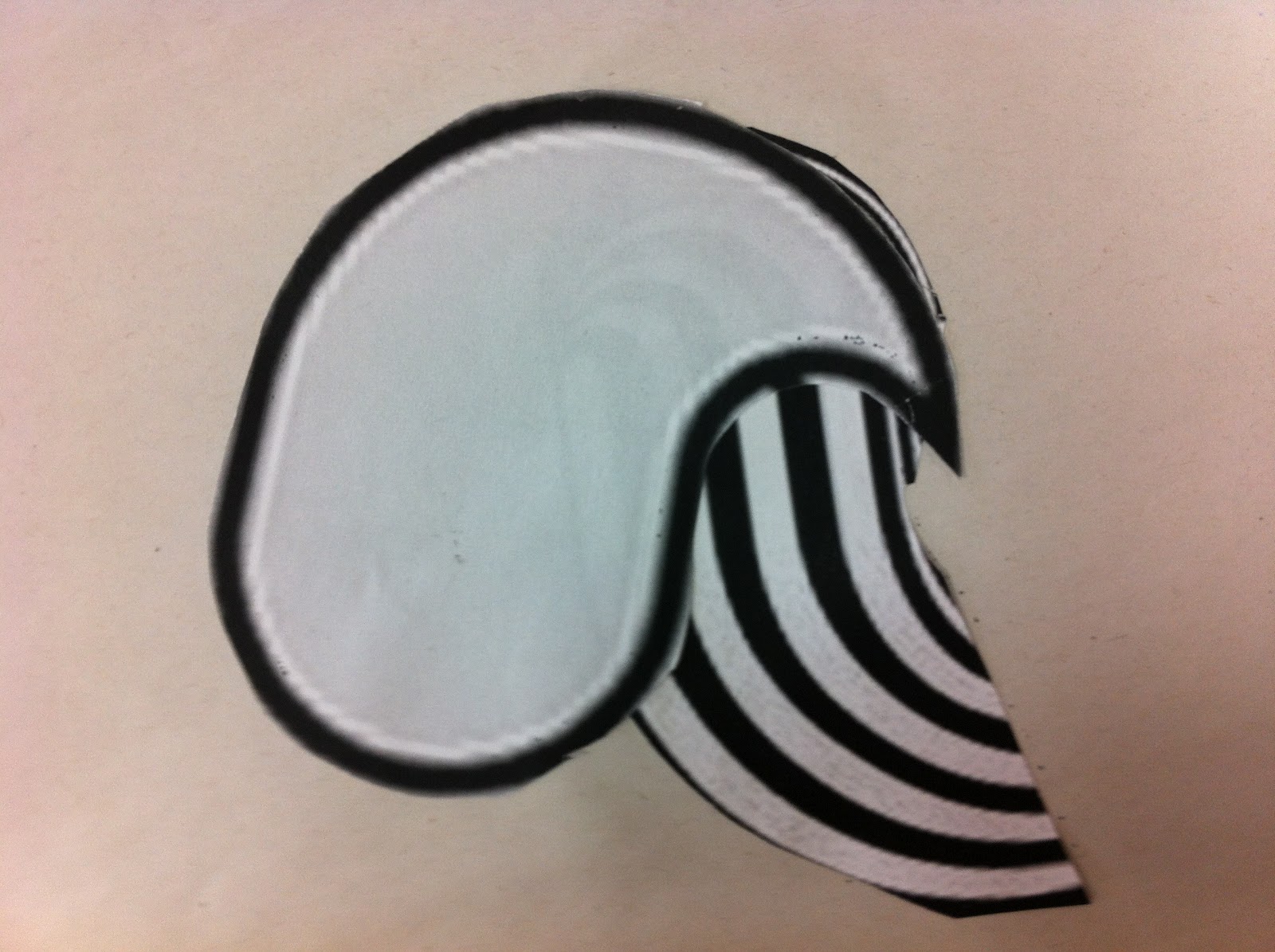
The next step was to take the letters we had created and develop them to create one which is solid and one which is just outlined, this again makes a huge difference to each letter and in some cases clearly suits either solid or outlined better.


proverbally yours// Posters crit feedback

Overall good feedback with some useful crit information, the main point being the legibility of the text, it seems, initially the typeface is quite difficult to read due to it's digital format with particular confusion of me using '3' instead of 'E' in the text to try and incorporate another aspect of time into the posters, however both peers said that it took them a little while to read it but once they saw it the concept worked well.

I think I will re work my pure type poster as to put the entire proverb on there instead of just 'time:healer' as I think the first and last poster are a little too similar, as well as this ensuring that people can understand the proverbs message fully.


 This crit feedback in-particular found that they had al lot of trouble understanding the type and explain they understand the concept but feel the type should be worked on to make it more legible. 

I think I  agree, I am going to try and developing the pure text poster to see if i can improve the legibility problem.

Friday 28 October 2011

Alphabet soup/ Workshop Illustrator development

On going progress with one of my 'Expand' typefaces, I have found I have learnt quite a lot so far on illustrator, but for this project I have found that I only need to use the pen tool, but even just using this has improved general knowledge about various different tools on illustrator.


 The 'a' was my original hand drawn example of the typeface, for a majority of the letters so far I have found it quite simple to form the rest of the alphabet using the same design, I have had some trouble with certain letters, such as 'h', 's', 'v' and 'z' taking these letters and managing to make them a legible design which follows the same concept has been quite tricky.


I have also had trouble manipulating certain letters to follow the same size structure, if you look at the x-height, many of the letters without ascenders or descenders are larger than the counters of the letters with ascenders or descenders.
This was due to the adjustment of thickness of each character and if I was to make letters smaller or larger to fit the height of the counters, it would really affect the aesthetics of the entire typeface as a whole, so instead I decided to maintain a height and a width for each certain type of letter. 

Friday 21 October 2011

Preverbaly yours// Message and interpretation

This brief is an interesting one and focuses entirely on visual communication, it's quite a good opportunity to play with our first Type and Image brief and see what ideas can be developed.


My Proverb is 'Time is a great healer" 


Initial idea design sheets.


For the text poster I got an idea quite quickly that I wanted to base my type on digital clock type, a few other ideas like putting the text on a label of a pill bottle or forming the text like it had been put on a doctors prescription, but after asking amber it would have involved image.


But from these initial ideas I got a couple of ideas that I wanted to run with. Due to the short time scale we had to complete these posters I didn't really feel like I had time to develop more than one idea.


I drew and worked out the scale of the text on Illustrator. I want to keep all the text the same style, and using the  digital clock template I mixed between upper and lower case letters, as well as numbers, I believe this enables the text to look more digital so the viewer can associate it definitely with time.


On the second type i used the same digital clock idea but then mixed it by turning the E into second markings you'd find on an analogue clock, but feel if I do this then I would not be able to show the medics cross in the text.


I feel time:healer is the only information that is needed especially seeming though I want to keep all 3 posters quite simple, also I didnt want to just write my proverb all over the posters as I felt it is more of a challenge to get people to understand your message just through visuals and minimal text.


I decided to colour the cross red in the middle to highlight it and create the image of a digitalised medics cross, while still maintaining pure text.


When it came to the image only poster I came up with the idea of using the medics cross as well but symbolising it as if it was on a digital clock, keeping the theme spreading from text to image, I want to keep it quite simple which has resulted in me coming up with a logo type image, but I also want to not complicate the design any further, I felt it is all that is needed to represent the statement ' Time is a great healer'.


I wasn't sure for the final image if I wanted to keep the same theme of the first 2 posters, while also making it obvious both text and image has been used, I ended up thinking that just combining the previous 2 posters was the best way to keep the design simple as well as visually pleasing.


These are a few different layouts I was experimenting with;


 After asking peers on opinions of layouts and explaining my thought process, it was agreed that I needed to keep the final layout just as simple as the previous 2 and finally decided to choose this as my final one.


 Again creating a logo style image, trying to keep it as neat, clean and affective as possible.


The more I look at the design the more I dislike the simpleness of each one, but then I also feel that is the area that helps focus the viewer on the focal point of the poster.

Poster designs photographed in context.


Taking the pure image as well as the image + type poster, this is the kind of situation I first envisaged the posters being in, maybe in some doctors surgeries OR in a psychology department, to give the message that time is the greatest healer.  


Monday 17 October 2011

Alphabet Soup/ Typeface Final Design


Finnal design for Alphabet soup/ typeface brief.

I found after the final crit and analysing my design i found the font was legible from a close distance or a large font size but as you got further away it was more difficult in certain letters to read especially if they were out of context, the only way I could improve this really is to lengthen the short side of the typeface, but I found doing this took away the contrast of small to large and this was the entire point of the font, 

I could have also tried to add maybe another part of emma's personality into the font to try and make it more relevant and obvious that this typeface was designed for her. However my entire typeface was based on her superpower and I feel this typeface does have a comic book/ superhero quality, so trying to add more aspects of her personality might of actually taken the true meaning away from it.

Friday 14 October 2011

Alphabet soup/ Workshop Illustrator

Initial Illustrator versions of hand rendered Alphabet Soup "Expand" brief


     I have decided to use one of these two designs after asking peers on their opinion and out of the 10 final designs these came top, the left hand lower case A is my favourite and I think using this typeface idea it will give me more options and interesting designs.

Alphabet Soup Typeface Badge Ideas


I am not 100% confident this typeface will work at a small size such as a 90mmx45mm badge but these are some ideas I had for the design.


Tuesday 11 October 2011

Alphabet Soup/ Typeface

In the crit last Friday I left with a few idea changes to my design, I decided to thicken the lines and involve those in the perspective change of each letter, going from thin to thick and I think this adds a lot to the designs aesthetics but also to its legibility , I also decided to curve the edges of some letters where needed which I think also improves the aesthetics and makes each letter more light hearted and visually appealing.

I have decided not to do my design on adobe illustrator and scan it and i quite like the hand drawn (geometric style) feel to the typeface.


Sunday 9 October 2011

Alphabet Soup/ Typeface

After initially reading this brief I thought it would be quite easy to make a typeface to characterise a person, but then after interviewing Emma I realised it was alot more difficult than i first thought, to try and make a typeface to portrait someones personality using the set questions I had wasn't an easy task, however, after reading the answers numerous times and coming up with several quite dull ideas, I came up with 5 main words to describe her. 

Metal (music)
  • Heavy
  • Scrap
  • Fast
  • Loud
  • Scream
Scotland 
  • Beautiful
  • Landscape
  • Hills
  • Windy
  • Cold
Height
  • Short
  • Cramped
  • Miniature
  • Tall
  • Small
Cat/ Tigers
  • Angry
  • Sharp
  • Stripe
  • Furry
  • Wild
Quiet 
  • Soft
  • Silent
  • Shy
  • Tranquil
  • Timid


Then after trying to deciding to focus on a typeface that used the words "Heavy" and "Cramped" I thought i had a good basis for an idea,


I took this "Heavy" and "Cramped" Idea onto Adobe Illustrator after liking the heavy blocks in the typeface mixed with the awkward cramped positioning of the letter, But found that even though i really liked a few of the letters, I found many of them were a lot more difficult to design using the same shapes. So I scrapped the Idea and started thinking again of an idea that would represent Emma as well as being simple and aesthetically pleasing.

When Interviewing I found that one of the main areas that kept popping up was Emma having a problem with her height as she said "the one thing she would change if she could would be her height" and her super power would be "Being able to grow to any six she wanted, whenever she wanted". 
This made me turn back to an idea I had the week before from the previous alphabet soup brief where I had to use the word "Expand" as my basis for an alphabet. 
i wanted to use perspective to show each letter going from small to large and perspective was the best and most interesting way I thought of.
As this was Emma's chosen super power I thought it would be the best way to put her into an alphabet.