Wednesday 30 January 2013

Design Production // End of Module Evaluation


1. What skills have you developed through this module and how effectively do you think you have applied them?

I believe I have improved in practical areas of the course, for example I have never used Dreamweaver before I came on this course and now i know at least enough to make a functioning website. I also learnt more about using photography in briefs as well as photo editing in photoshop. I would like to use these methods again but next time i may apply them to a different area.
Through research into the different areas of the module, I have obviously learnt a lot more than print than I though I would, imagining a job go out to print is now a lot more easy now we have learnt how to prepare documents to send to printers. Actually visiting a printers as well was a learning experience, I still need to actually get my act together and utilize these different print methods and finishes instead of sticking digital and 2D

2. What approaches to/ methods of design production have developed and how have they informed your design development process?

Slow and steady - I came back after Christmas a little bit panicky about all the work that needed to be in for this deadline, I have hated feeling like that because it has been two weeks of un pleasantness which is not what I want from Graphic design, but with the last ISTD brief, i took it step by step like I should do and blogged while I have gone along which has resulted in a piece of work which has quickly and more effectively been confidently put together with a clear direction in where i intend it to go.
Using the vinyl was a first, and obviously the digital cutter does most of the hard work after the designing stage, but by hand transferring the vinyl to the mount board cover was quite a task.


3. What strengths can you identify in your work and how have/ will you capitalise on these?

Photography, I enjoy photography, both creating and viewing, and have wanted to incorporate it into a brief since starting the course, so i think this is turning into a strength which I will be able to utilize in future projects. i often forget that there are endless ways of creating design and it doesn't all have to be done on illustrator.
Branding, It is an area i enjoy and one that I would liek to further improve and create in the future, the branding and logo I created for the ISTD brief i was very happy with, as well as the website design mock up, i regret not actually coding the website but due to time limitations with the deadline approaching i thought mock ups would have to do.
Learning Dreamweaver, it may not yet be a strength but it is a step further than  was a few months ago and as long as I ensure I keep using the skill then one day it may turn into a strength.

4. What weaknesses can you identify in your work and how will you address these in the future?

My Bad time management at the beginning of the year has really let me down, especially in the Design for print, my motivation was lesser for that so i ended up putting it off until i couldn't anymore, this resulted in thedesign stages being bitty and un coordinated, which in turn made me even less motivated, and i think if I would have jumped straight on the task from the first day then i would have been able to structure my design process much better and end up with a piece of work i am both confident and proud of.
Blogging research, I do research and have my own way of collating data and using it to provoke my design, but blogging it is not a strong point of mine, it is very much often the case that I will doing both visual and theoretical research while I am designing with the intentions of going back later to blog it, but that either doesn't happen or I cant find the link or image or reference that I first found again.

5. Identify five things that you will do differently next time and what do you expect to gain from doing these?

- Use different print processes and finishing methods, i have up to date used limited print process's or finishing techniques and I feel like I am missing out because of it, It will hopefully broaden my production confidence as well as improve my all round skills as a graphic designer.

-  Blog everything as and when I do it! I don't want to get lost with my blogging again, so ensuring that I stay on top of it will not just make sure i have reference for learnings sake but it will also help me structure and plan what I am doing with a design and why. I get really into blogging on certain briefs and go off it in others.

- Do a little bit every day, My mistake in this module was having a too lazy first half of the year, I want to stay ontop of my work so I dont feel stressed as I have these past couple of weeks again.

- Spend longer in the design studio. During the week I often find it difficult if we have free time to finish work to stay and do it at uni, however since getting back from christmas and actually using the day to my advantage it has made me realise I am actually much more productive at college than I am anywhere else.

- Plan everything better - get a daily diary so that I make small plans and daily tasks for myself to complete, this would help me both organise myself better, complete work on time and release the stress and worry of work. 

6. how would you grade yourself on the following areas? 

Attendance - 4
Punctuality - 4
Motivation - 2
Commitment - 2
Quantity of work produced - 3
Quality of work produced - 3
Contribution to the group - 4
Saturday 26 January 2013

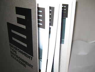
Design for print and web // Photos of completed printed magazine

The finished article has ended up turning out quite nicely, I may have to re think printing methods however as this single print out ended up costing be over £20 to produce overall, which obviously isn't a viable option if printing on a large scale as it would make it very difficult to make any profit as it is doubtful that people would be spending that much on a monthly magazine.


The cover i produced out of charcoal mount board, to give it a solid protective cover while keeping costs to the minimum, the cover design is meant to be limited as to leave all the focus on the logo and branding of the magazine, also it helps not to take away from the photography which is the main visual aspect of the magazine.


I used black vinyl (which I though changed colour in bright light) to finish the logo and title of the magazine, I am pleased with the result, it works well on the matt surface of the mountboard


The cover also protects the pages inside, as the book is A3 it would be easy for the pages to weigh on the ring bind but i have made the covers a few mm large than the spreads inside which seems to create a decent level of protection.


I like the finish of using cut mount board for the cover, it doesn't look posh but it gives the magazine a unique edge, as i haven't seen a monthly magazine this size or this format before, so it would be more likely to draw attention.


The prints (although expensive) turned out really nice, the photographs look fantastic printed on the matt photo stock, This made me quite happy with my photography venture, which has made me quite excited to use it again, at least to always consider it as an option.


I enjoyed creating this magazine, each aspect brought a new challenge but because I organised myself a bit better than I did with the other two modules in design production, i have had a solid level of understanding of the direction I'm going in throughout.


The photo taking and the photo editing were particular favorite areas of mine, as well as the logo design.


Ring binding the magazine seemed to be quite a good idea, it is sturdy and holds all the book firmly in place while also giving the flex ability to fold the book back on itself, a secure binding method which will be considered in the future.


Friday 25 January 2013

Responsive // Bacardi - Design ideas and testube dimentions

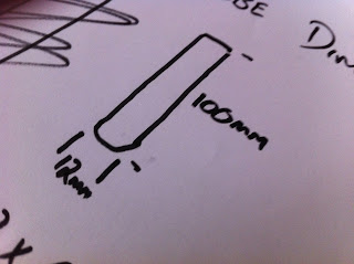
I took the next step and ordered a number of small glass testubes dimensions of - 100mm H x 12mm W.

I thought when I ordered them that these were the dimensions for the inside of the tube but because the glass is quite thin the over all size is not that big, however it is still an appropriate size for a cigar and will be perfectly acceptable for my concept proposal when I submit this brief in March.


I started playing around with box shapes and dimensions so i could create the net for the Box Joint Box I want to create.

I have also added a place for a min drinks recipe book that will accompany the Bacards.


I went on to draw a more accurate representation of what I intend the box to be laid out like. and the required dimensions of the box when I attempt to make it or get someone else to help me make it.

Audience.

I think this package when completed would be aimed at parents, friends and partners of 18 - 25 year old males as this would be more like a gift pack than a product people would buy for a night out, the purpose of this product is to introduce the drink to men who never even considered Bacardi as an option.


The drink recipe book will contain several of the most popular Bacardi drinks that I found on cocktail and drinks websites. the aim is to show the new consumer that it isn't just a "girly drink" but a high quality rum that can compete with Captain Morgan, Sailor Jerries and other popular rums.


Tuesday 22 January 2013

Design Production // ETE Magazine presentation boards

Below are the 5 presentation boards i will be using for the presentation on Wednesday, I have tried to break the presentation up into 5 major sectors which I think contain the most important factors to put across to the audience.
  • Magazine
  • Interaction
  • Website
  • Gift Pack
  • Distribution


Magazine - Focuses on what the magazine is, what it looks like, why it is a good idea.

Interaction - How the magazine is mostly aimed at amateur  photographers, the work they would upload to the website would produce next months issue, which would give the audience more incentive to keep uploading and buying the magazine as they have the prize of getting there work published, while also getting inspiration from others work.

Website - The website is there to allow people to subscribe, give information about the magazine, provides glimpse of what you can expect from an issue, allow reader to upload photos of type in the environment as well as provide the magazines contact information.

Gift Pack - Explain further promotion of the magazine by producing an initial subscription gift pack which includes, a drawstring bag, a digital camera wrist strap, a camera neck strap, a digital camera case as well as a choice of tshirts, these items can be sent to initial subscribers as well as being handed out at magazine / photography fairs as promotional material.

Distribution - The magazine would be delivered monthly to subscribers, but individual monthly issues would be on sale in street book shops such as WH Smith. Waterstones and Foyles.


Design for print and web // Additional promotional items


Some of my feedback after getting some advice on the brief was that I hadn't explored enough with products, soi thought of possible items that could be given away to initial subscribers, as well as items that could be given away free at photography and magazine fairs as promotional material.

I think the logo is quite strong on it's own so I photoshoped some examples of possible items that could be bought in large quantity cheaply and could be branded with the ETE logo.

 DIgital point and shoot case


 SLR neck strap


Digital wrist strap


Drawstring bag - which the initial gift pack and issue of the magazine would come in 


A choice of T-shirts that would get updated and re designed monthly, also can be personalised with your own photo.


I also quickly mocked up what the website would look like in context for my presentation boards, 


Monday 21 January 2013

Design Productions // ETE magazine final design Issuu

An Issuu of the final magazine design, hopefully as you go through you can see the black line where the page will be perforated to allow the reader to remove the pages if they feel they want to use them as posters. 

I am happy with the final design, it seems that the photographs I took while in South Africa came out really nicely (if printed successfully) I have been wanting to use photography in a brief for a long time and never got round to doing it, I think overall it I have enjoyed this brief more because of the fact I was able to use photographs as a large element of the design, I liked working with them and editing them. it is a satisfying feeling when I look back at the initial photographs and look at the finished article, you can really see a difference.


Design for print and web // Website mock ups

Completed web site mock ups for ETE magazine Each page is focused (like the magazine) around photography, after all the target audience I am aiming out to would want to see as much photography as possible, and because they will be uploading their work it could be chosen winner and archived photos that could be changing weekly. This would also give people a good incentive to return and keep visiting the website as they would want to see if the photos are going to be appearing as the webpage backgrounds.


Similar layouts to the magazine, I quite like the style of the site, I personally think it work really nicely as a website, especially aesthetically, I like the fact the logo is bold enough for the navbar to line up with it, the intention of the logo was to use the letters 'ETE' to form an abstract SLR camera, so photography and typography maintains the theme throughout


 If this was going to be made and the entire project was going to get underway, i think I would have to get some help creating the actual website if subscriptions and uploading was actually going to take place, as I think there would require knowledge of web design that I haven't quite acquired yet.


 the text boxes could slide up from the bottom when the link is clicked, as the text is always in the same place, it would be a nice effect especially as the opacity of the text box is low.


Sunday 20 January 2013

Design Production // Design for print and web - ETE website initaial scamps

as I want the visuals of the magazine and it's associated website to remain constant, I will base the website around a similar layout, as in the magazine layout I would like to use a single image for the background of the site, purely for aesthetics reasons, as I think full paged photographs look brilliant. 
As you can see on John Wrights website below.


Many of my initial scamps are just idea generations of different possible layouts for the nav bar, but their are certain elements that I definitely want to include which have been inspired from visual research on my context blog.


I think the solid logo in a fixed position over each background would work nicely, as well as having a lighter grey opacity on the nav bar so that the imagery can be seen through it as on the 2nd example of John Wright's website above.


Text that will be needed on the website I think I would prefer it to be pasted straight onto the background photography instead of trying to create borders or individual coloured backgrounds


Now I need to decide on a layout and develop it further and more specifically to suit a magazine subscription website, I will need to work out the certain elements needed on each page.

Design Production // Design for print and web - ETE logo development and page layout alterations

Using Gotham Ultra, I started to play around on illustrator with my initial ideas, i like the way the font fits together. As I am keeping the magazine mostly gray scaled, it was important that ithe logo would fit in, whether it was on the cover, within the pages of the magazine, on the website or on any other promotional media.

Keeping it all one colour will really help keep the theme, but it may be more difficult to work out what the logo means. 


I really like the above layout of the logo, but I am not too keen on the fact I have to change the colour of the 't' to make it make sense. However, my thought are at this point, if the logo is introduced on the cover or the website, it could be given with the title of the publication and once the logo has been associated with the name then it is not that important that it is 100% legible, as I said before the logo will just be an image/ pattern to be associated with the magazine.


 I really like the 2 designs above, I think it creates a strong image that could easily be linked to a photography magazine. the type of the title underneath the logo will only feature together on the cover of the magazine as well as the website.

It also as a whole looks like a SLR camera which again just emphasises the photography and typography theme of this brief.


This is how the logo will be placed on each page, I personally think it suits the page layout as well as the photography incorporated

Design Production // Design for print and web - Environment type Environment Magazine logo development


I wanted quite a bold out standing logo that can be the single element on the cover, while also working throughout the rest of the publication.

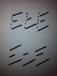
These are just some quick initial sketches.


I think there will be some clever ideas that come from abbreviating Environment Typography Environment, as ETE have some similar shapes and patterns in there form so there will be some good opportunities to play around with that.


One of the key elements for this logo i think will be the choice of font, having played around with a few bold/ ultra bold/ condensed fonts I think my favorite is Gotham Ultra, it is a really good looking heavy font which suits uppercase.

as you can see here below