
Magazines
I have initially looked at 3 different magazine spreads, one I thought showed a good example of readability and legibility, one showing a bad example and the final being somewhere inbetween the 2 extremes.
GOOD
BBC History Magazine
this is my good example from BBC History Magazine, when looking through magazine spreads it was quite difficult to differentiate what is good and what is bad, as most magazines (unlike newspapers) contain single articles over a 2 page spread or make it quite clear when one article has finished and another has begun, therefore they are all quite legible and readable. However I did notice that some magazine focus more on advertisements which in some cases really confuses a page layout.

As you can see this spread is not all type, the article revolves around the image, however there is still different typefaces, scales and weights of type used which automatically prove that there are clear bits of information that are more important than others.
Having larger headings and sub-headings direct the reader to important pieces of information as well as giving the reader an idea of where articles start and finish.
I chose this as a good example as i would challenge anyone to not easily be able to follow and understand the flow of the article, it quite clearly has a title, sub headings and block text and can be followed simply.

After deconstructing this magazine spread, I found their were
- 5 different typefaces used on the entire page, this includes italics, page numbers and headers.
- 15 different font sizes
I feel in the most part that it does exactly that. with a large bold title being followed by sub headings, leading onto block text until eventually using the smallest most discrete type for things such as page numbers and page headers.

Here I have used the same concept but in order of type weights going from boldest to lightest, generally it follows the same patterns, with most pieces of information remaining in a similar order.
It is quite difficult to order the type by weight alone, as some type may be much smaller than others but are also bolder, This may be to attract the reader to pieces of information that may not be the core of the article but are still expected to be viewed, such as the title of the magazine on the page headers.I also believe that purely using black and white on this page allows the hierarchy of the type to be noticed more as there is no confusion over colours attracting the readers attention.
BAD
Dogs Today
I Chose this magazine spread as my bad magazine option, as initially it is heavily advert orientated, which makes the flow and readability of the page a little more confusing before we even start looking at the type, it is a busy spread with a lot of colours contrasting with each other.

- 28 different typefaces used on the entire page, this includes italics, page numbers and headers.
- 27 different font sizes
Virtually every typeface is different on this DPS I guess this is because the adverts take up most of the spread, each advert uses several different typefaces as well as weights and font sizes. It makes it much more difficult to follow the flow of the magazine as different information stands out more, the contrast of the advert with the black background attracts the eye more than anything on the spread, it uses larger text as well as using the solid black background and bright coloured text to help jump out the page, but I am not sure that this helps the readability of a page. Personally if I saw a page like this in a magazine I wouldn't even bother reading it as there is too much randomness to the page which makes me think it's all just adverts.

Middle
Garden Magazine
I actually quite like this spread, it keeps all the type simple, and minimal confusion with colours, again a very simple page to follow through, not too over crowded.
Because the same colour has been used for all the headings and sub-headings it makes it easy for the read to quickly workout where articles stop and start, as well as indicating which pieces hold the most important parts of information

- 10 different typefaces used on the entire page, this includes italics, page numbers and headers.
- 16 different font sizes
A nice simple deconstruction, a clear order instantly revealed itself once all the type was cut out. it surprised me how many different fonts were used as when you look at the spread it really doesn't look like that many could possibly be used, I think this is because the colour scheme remains the same across the 2 spreads.

Posters
Good
Starbucks Price Board poster
This is not a poster that you would expect, because it holds information that needs to be read and understood quite quickly as people usually read it when in the que to order their drink, so they need to be able to read the choices and make a quick decision while also incorporating the price into their decision.
This is why I have chosen this poster as my good option, it contains very little change throughout, it is not the most exciting poster in the world, but it does it's job simply and clearly.

- 1 typefaces used on the entire page
- 9 different font sizes
As expected when deconstructed there are only really size changes for headings of categories and drink choices and prices. only 1 different colour used to promote the Starbucks card, but it is quite clearly which areas fall under each category, because the poster is large, it needs larger type as the information needs to be read from a tleast 2/3 meters away, on this posters there is a larger average font size than either of the other posters.

Bad
Club Night Promotional events poster for Mint Warehouse
This is my bad poster option as it has way too much going on within the design, if it is necessary to include that much information, then there shouldn't be that many different colours, photos and fonts used. It looks like pure chaos on a page. However, this may be the emotion they were aiming for when designing it, as it is a poster for a Warehouse Rave which are usually mental, loud and chaotic, so they may be exciting their target audience by promising a crazy time.

- 17 typefaces used on the entire page
- 26 different font sizes and colours
From first sight of this poster you have no idea where to look first, there is no obvious main heading, there are different sized type randomly placed over the page. the fonts promoting the dj's and time and place of the event are the largest on the page and the grab the attention of the reader first. It really is difficult to understand what pieces of information come in what order, so you end up scanning the entire page for a while to randomly pick up bits of info in no particular order.
Other sections they wanted to stand out have been put in neon type colours, so even though the font isn't the largest it is still one of the most prominent things that jump our at you because it stands out from the background chaos.

Middle
Club Night Promotional event Poster for The Warehouse
This is a much better example of a promotional poster for a club night, not as much information and confusion on the page, it shows a clear heading with a list style layout following, generally having the most important information in the largest font and in some cases making it stand out more by changing the colour of the type. I think the colour mix between the white and the orange is purely for design purpose rather than distinguishing the most important pieces of type. The white type actually stands out more than the orange type anyway due to the darker background.

- 21 typefaces used on the entire page
- 29 different font sizes

Newspapers
Good
The Guardian
I chose this for the good Newspaper option as because it only contains one story, it is not too overpowered with advertisements, the article follows an easy to follow legible structure broken up with one image in the center, to focus to layout around. even the advert for Orange at the bottom uses minimal fonts, sizes and colours.
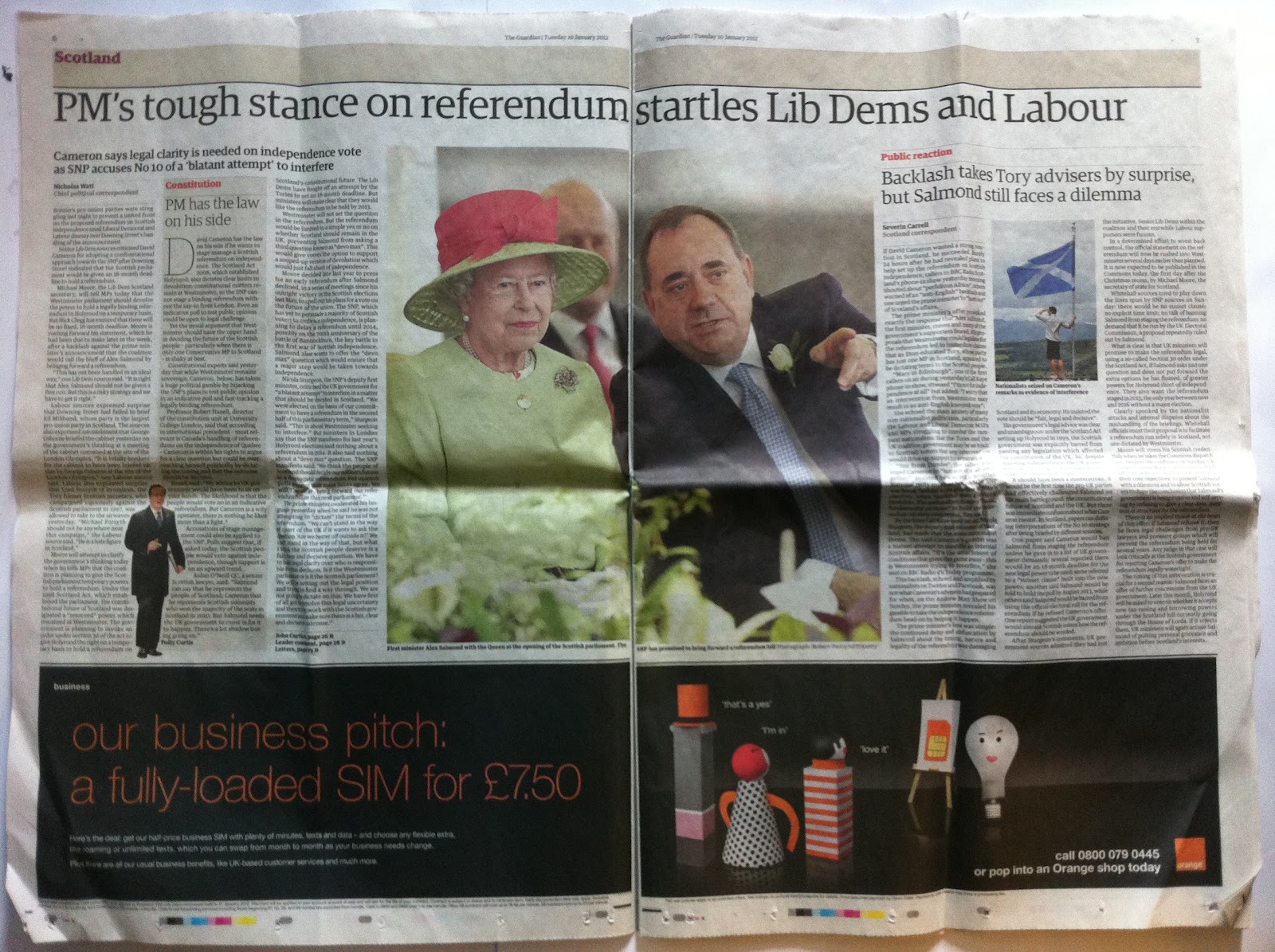
- 9 different typefaces used on the entire page, this includes italics, page numbers and headers.
- 19 different font sizes
The font size changes on this page are not that massive, the heading type is not that large, it is actually only a similar size to the main type in the Orange advert, but because of the layout I don't think this is to important, the reader can still clear flow along with the layout of the article.
Minimum changes in colours throughout, again certain pieces of info standing out more than others due to their colour and background colour.

Bad
Yorkshire Post
I think this layout is again a little confusing, but still has good readability and legibility, as the body copy is still quite large and not placed too close to any adverts of photos. It is again the adverts that ruin the simplicity of the page, the article has quite good consistency of type faces, sizes and colours. It is the adverts that use hundreds of different fonts and sizes, all crammed into the small allocated boxes.

I could work out how many different fonts their were but all together on the page there are
- 52 different typefaces, sizes, colours and weights

No comments:
Post a Comment