
We have been asked to take our favorite Pantone colours from the Primary and Secondary colour wheel and use objects of those colours to give 10 examples of each of Itten's Contrasts.
Itten's Contrasts;
- Contrast of TONE
- Contrast of HUE
- Contrast of SATURATION
- Contrast of EXTENSION
- Contrast of TEMPERATURE
- COMPLEMENTARY Contrast
You can find my chosen favorite Pantone colours and the coloured objects I have chosen to use in an earlier OUGD404 post
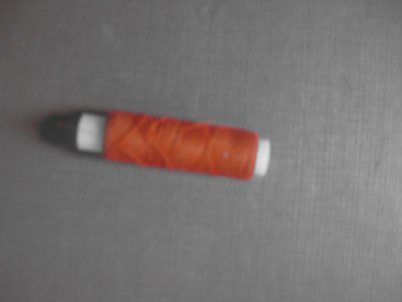
Contrast of TONE

In this case I have focused on tone of monochromatic values, ranging from black through lighter shades of grey to white.


Contrast of HUE


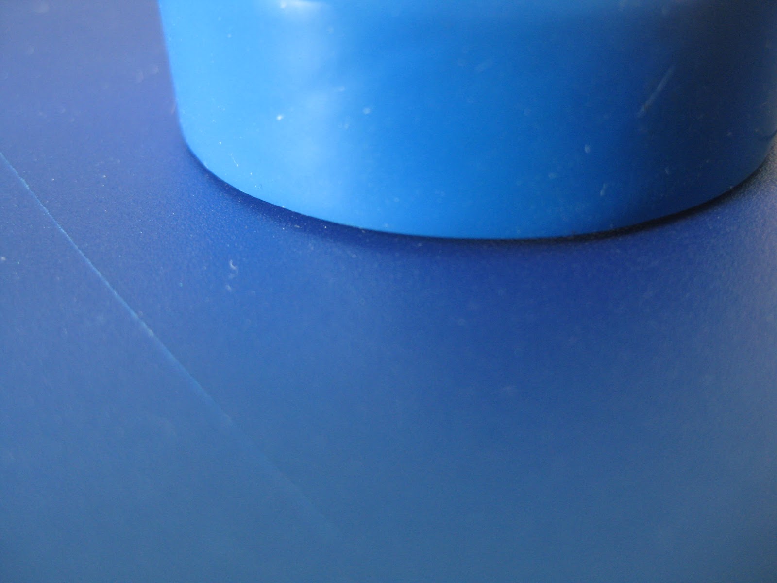
Contrast of SATURATION

In this case I have tried to gather examples that show the contrast of saturation, starting with darker values leading down to lighter values of blue, this shows different levels of saturation.


Contrast of EXTENSION


Contrast of TEMPERATURE


COMPLEMENTARY Contrast


No comments:
Post a Comment