CMYK - Process Colours
-Subtractive
-Process colours is an alternative name
- The more colours added the darker the print colour will be, after adding all colours you should end up with black
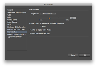
New illustrator allows you to alter the colour of your art board depending on your preference as you can see below.
go to - Illustrator - User Interface - Adjust Slider
- The most appropriate art board colour is 50% grey so tat the colours represent themselves in the closest way.
There are several ways to add colour on Illustrator
Colour Picker
Colour Pallet
Colour Pallet - Show options
Swatches Pallet
The advantage of using the swatch pallet rather than any other method is the fact that you can create your own swatches which will allow you to easily keep consistent colour throughout a project, instead of having to manually re adjust colours when you need to on the colour pallet.
It also allows you to easily alter a certain colour you are using, and once it is adjusted it can change every element of your art work that uses that specific colour.
Setting up a swatch pallet
Firstly delete all swatches that are not being used
To create a new swatch you have to pick your specific colour in the colour guide, once this is done you go to the colour guide options and click create new swatch.
It is recommended to keep the name of the swatch as the CMYK percentages to help you see/ adjust each individual colour
This will then add the chosen colour into the swatch panel
you can also choose different colours from the colour picker and if they are used on your design you can go to swatch colour options and select 'Add used colours' and it will add all the colours used on the page to your swatches.
These swatches are added as 'Global' swatches
If it is a global swatch it means that any where on your page that uses that specific will be altered if the individual swatch is altered.
This is to replace having to go round and alter each individual vector.
You are also able to adjust the tint of an individual colour on the colour pallet, this can then be saved as a swatch and is added to the family, then if any of these tints are used and you adjust the original 100% colour it will then adjust that 100% version and all of the various saved tints of the same colour.
Some interesting colour patterns can be created very easily and quickly, also if you find you want to adjust any colours it is much more simple and can be done in seconds.
Spot Colour
An ink that isn't ,made up of CMYK, it is a single individual colour that is purely one colour and has no others mixed into it, as you find with CMYK subtractive.
Spot colours help print in both florescent/ metallic/ luminous
Spot colours also help keep the cost down when printing as it does not take numerous inks to create print, it would only use the one specific spot colour, this is recommended when prints with limited colours are used.
When screen printing using spot colour can help with reducing your work load, as if printing with CMYK you would have to create a screen for each CMYK colour, but by using a spot colour you will just be able t o use one screen.
CMYK printing can easily be altered by accident and can adjust the outcome of the colour drastically, therefore branding / prints using a constant specific colour (cadbury's / Heinz beans) will use a spot colour so that when packaging is printed the colour will ALWAYS be consistent no matter where or how it's printed.
Pantone is the European range of spot colours, these can be communicated with the printers so both parties know exactly what colour the outcome should be.
Each of these Pantone colours have their own individual coding/ reference number so the correct spot colour can be found all the time.
Swatch Colour Libraries
This allows a simple way to find specific referenced Pantone colours, you can choose which ever colour you want by typing in specific reference code.
Once a swatch is chosen from the Pantone swatch library it will automatically be placed into your own swatch pallet.
From their you can then adjust the tint of this colour and create further extensions to each colour family.
These swatch pallets can be the saved for other projects you can do this by following below.
This colour be saved in the swatch file that is set up by Illustrator, OR you could save it onto your desktop or alternatively you can save it in the file with the rest of the files for a specific project.
This means when you send work to clients, printers or collaborations you will also be able to send the accurate swatch pallet along with your design and images.
It is possible when the swatch pallet is saved that it won't save the variations of tints but will however save the original 100% colour.
You can save the pallet in a different way, this will then save the pallet in a way so it can be used in other Adobe software, this again will not save the tinted versions
This is done by saving as an ASE as you can see below.


No comments:
Post a Comment