
I had some difficulty constructing the nets, but this is only because the stock was extremely thin and delicate, which made it more difficult to confidently put them together without damaging the stock in the process.
Ideally I would like to use stock similar too / a bit thinner than the card used for the Starbucks cup sleeve.
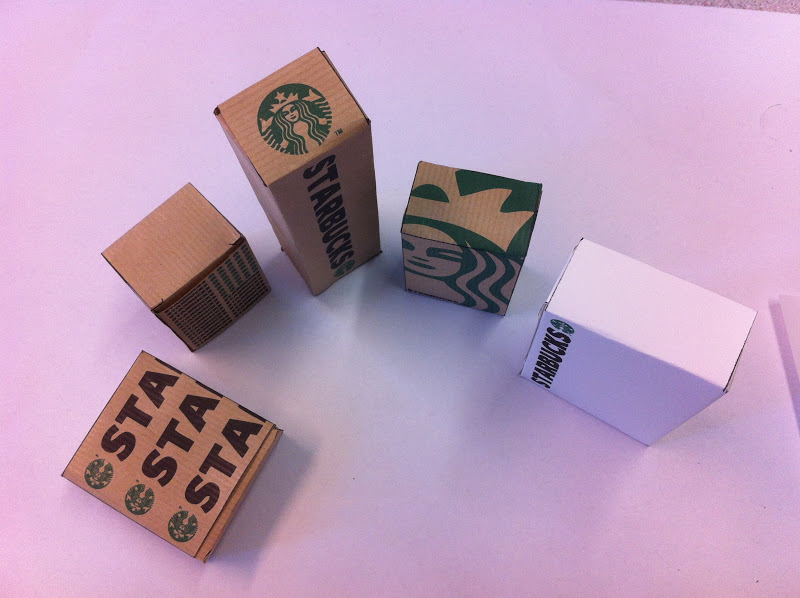


This design is my personal favorite, I know the stock needs improving so I am not going to focus on this aspect in my analyses, the logo layout on this net worked out nicely, it is the largest scale of logo out of all my produced nets, and it comes off quite nicely. The size of the logo makes it wrap around all the panels and faces of the net, which creates a good aesthetic while maintaining the design around the entire box. it creates large interesting patterns on each face.

This box didn't want to remain closed, however I still think it is a unique design which you wouldn't expect to see on a piece of packaging, I am pleased with this, as even though it is unique I think it still keeps the identity of Starbucks thanks to the continuation of the logo and type as well as the stock texture and colour.

This was quite a generic design, I could have been a little more experimental with it, as it was the most differently shaped net, out of the group, it felt different imediately, so maybe I did not focus on the uniqueness of the design as much as I could have, still the horizontal simplicity of the text gives a clear no nonsense message of the company it is promoting and that is one of the elements I wanted to come through, I wanted the design to remain as simple as possible.
One of my first design ideas was just to place the logo and type very small in one corner of the box, this evolved into this design as the size of the actual box resulted in me increasing the font size so the result was a little more obvious.

This design i feel is the most experimental that I produced, I tried to initiate the design by following up an idea which I thought Starbucks would never use in their promotional products, each side is meant to for the letter 'S' and 'b' using the repeated logo and type to form an interesting pattern of type. Again because of the size the logos didnt not print out properly and have turned into green balls, but still the message was delivered i think.

On this net, I unfortunately had some difficulty with the stock, and it ate my final piece of parcel paper when I was printing, so therefore i saw this as an opportunity to try a thicker stock and see if I could create a sturdier piece of packaging.
The stock I chose was some water colour paper that I had at home, it has a rough texture and is much more durable.
When I printed it the result was surprisingly nice, because the texture of the paper is so rough the ink has bled quite a lot, it has made the logo nearly un recognisable, however, the bleed on the print makes the logo and type look like it has been manually stamped on, and I especially like the effect on the type. The stock itself holds up much better than the parcel paper, but then what would you expect.
Feedback
The crit today, followed a similar format to last weeks A History of... crit, small groups were split into pairs, then we crited each other pairs work individually,
The feedback below is mine, which I got from the other 2 pairs.

The feedback I got was pretty much what I expected.
The strengths that were focused on were
- The design with the large green logo was the best of the set and sutied the Ethos of the company.
- Good use of variation in the stock.
- All designs work as a set (apart from the white card)
- On the white card design, there was a positive reaction to the bleed on the type and logo, made it look hand rendered which suited the style of the company.
Areas for improvement
- Stock suits the print but is too thin to be effective for packaging.
- Experiment with thicker stock.
- Try to seep designs consistent.
- Get rid of the black fold lines on each net.
- Experiment with different shaped nets
As teh nets I brought in last week weren't really nets, i limited myself to the nets I could find lying around my house, and this was probably not the largest variety of shapes, this however does make the group look more like a set
No comments:
Post a Comment