While in the lecture we were asked to experiment with different colours experimenting and analysing, playing with Itten's 7 contrasts,
- Contrast of TONE
- Contrast of HUE
- Contrast of SATURATION
- Contrast of EXSTENSIONS
- Contrast of TEMPERATURE
- COMPLEMENTARY contrast
I really like the contrast of the green background withe these tones of colour it is a smooth transaction from the yellow into the green.
In all these cases they are all quite sharp contrasts apart from the yellow where they seem to blend together in certain areas. because of the lighting in the room it was difficult to maintain a constant colour for every image. in the photo with the purple background for example, the yellow seems much lighter compared to other images and this is perceived to be a change in the tone of the yellow, leading it to more of a lighter,/paler yellow.
Changing the contrast of extension
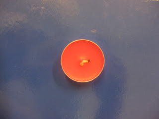
Using the violety red colour as a set colour i was experimenting with the contrast of extension while trying to see what colour contrasts the red had the biggest or smallest impact on.
The violety red with the bold yellow background seems to have a large impact because even though there is a small amount of it in comparison to the yellow it takes the attention away from the yellow making it the main focus to the eye.
It also in this case has quite a bold impact contrasting
with the green but in a softer way than with the yellow
I quite like it.
Because of the depth of the blue background the light bright
tones of the red in this image makes you see the huge distance these
colours are from each other in the colour spectrum.
However the small amount of red centered on the blue does immediately
have an impact.


No comments:
Post a Comment