I experimented using Ittens 7 contrasts;
Firstly the contrast of TONE- Which is a juxtaposition of change in light and dark values, this does not just take place using colour it can also b monochromatic.
Choosing the secondary colour of orange we began by testing our colours with different tonal monochromatic backgrounds using black, white, dull white and a gray tabletop. there is bright orange and a dull orange in contrast which is also experimenting with the contrast of SATURATION both being prominent on all backgrounds, it may have been the lighting in the room but the change in tone of the orange isn't really that noticeable.
Except in closer images where the change is quite obvious the dull orange starts to look more browney pushing the brightness out of the lighter orange therefore making it more visually attractive to the eye
I also experimented with the contrast of TEMPERATURE and EXTENSION, as you can see below using the warm temperature of the orange as a border having a small area of blue in the centre (even though there is no contact) i feel the coldness of the blue really stands in front of the orange. the extension is interesting because even using a small amount of a contrast temperature can really take the viewers focus away from the warmness of it's surroundings.
This is an example of COMPLEMENTARY contrast using the complementary colour of orange which in this case I have chosen 2 different tones of green, the borders of the greens seem to vibrate and really confuse and tire the eyes the greater the quantity of contrasts in a small area.
The contrast of HUE where I have used a variety of different hues on a black back ground, the greater the distance between the different hues on the colour wheel, the greater the contrast.
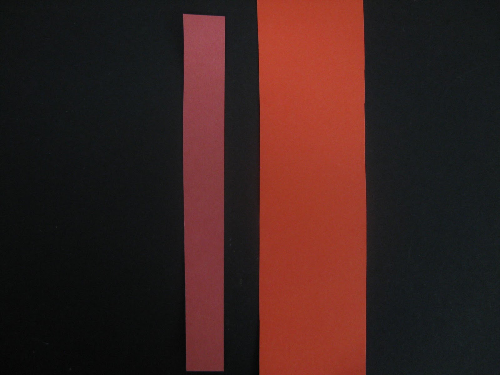
You can see in this picture above that the 2 tones of red each really have a huge impact on the other, on it's own the red on the left would look quite bright with the black background and no other colours around to compare it to, but once you throw in the larger amount of purer, warmer more orangey red it makes the smaller strip seam more magenta going towards the violet side of the colour wheel.
Different contrasts of saturation and tones using complementary colours.
changing the saturation can make letters or objects almost disappear into the background, the 'c' can hardly be seen in this first example, where as the white clearly stands out in comparison.
This is the reverse and as you can see the prominent colour is now the brighter orange the dull one still slips backwards because of its darker brownier colour, it cannot compete with the brighter orange. and finally when you see the complementary colours in contrast it it quite difficult for me to say which one stands out most, the green I think comes forward most, but that may be more down to it's positioning, the white also stands out very well on the black surface.
Once more colours are added you can end up with some quite visually pleasing images just using shapes and the Ittens contrasts as seen below.
trying these shapes and colours using daylight on a transparent surface also creates quite an interesting aesthetic, but in this case because of the light through the window it kind of silhouettes the letters, therefore making them much darker compared to the bright light coming through the window.


No comments:
Post a Comment