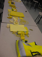
Taking the coloured objects asked to bring for the session, 5 Green, 5 Blue, 5 Yellow, 5 Violet, 5 Orange and 5 Red, they were organised into appropriate places according to their place in the colour wheel and then each individual colour was then organised by smaller groups going from darker to lighter tones OR different saturations of those colours.
As so many different shade of each colour were brought, it made it interesting but quite difficult to seperate each colour going from dark to light with the "Purest" colour as a base mark.
This being the tint using Pantone colours 7487-U, 7486-U and 7478-U, We should have switch the first and second around to go in the correct order.
And Finally by changing the saturation, Pantone colours 278-2-C, 265-1-C, and 567-U


No comments:
Post a Comment