
Foe the 5 post cards I have decided to use these 5 pictures I took earlier this year at Flamborough.

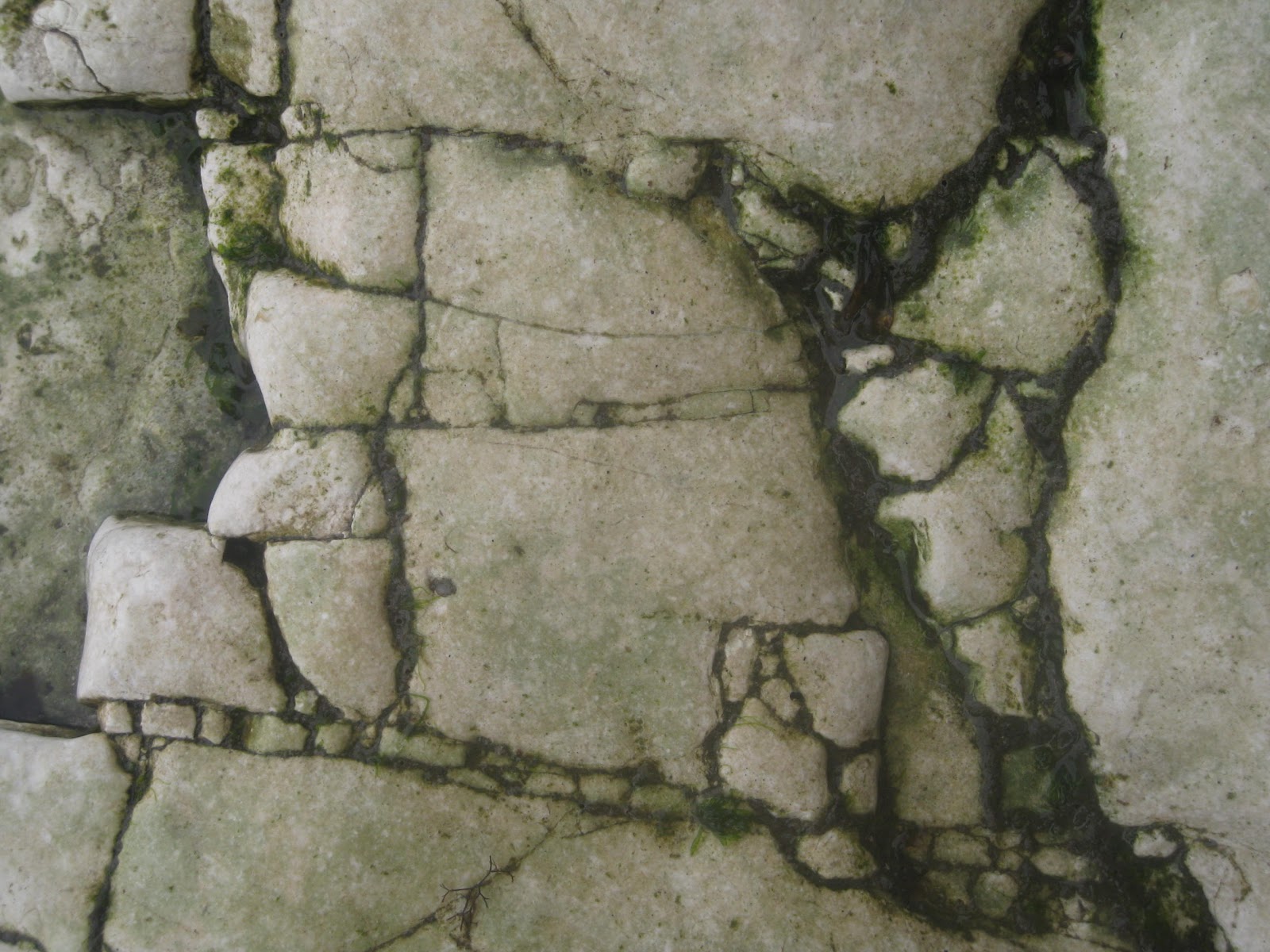


I Like these photo's They have interesting shapes in the cracks, which I think would allow interesting visuals for the post cards.
I am going to use Cyan, with adjustments to saturation and hue in each image.
Design Process
I wanted to get rid of all existing colour, so gray scaling the photo and adjusting the brightness, contrast and levels of the image, once this has been done, I can change the file back into a CMYK file which will allow me to create the base of the cyan colour.


I created a layer mask to adjust the hue and saturation of the image, with the shapes that are formed from the rocks it creates a nice light and dark contrast of blue

This is the result of the hue and saturation alterations, the rocks create a really nice texture that suites the blue covering going from bright highlights to the dark crevices.

By colouring the layer masks I removed the colour change from random rock shapes.

I like the contrast of the grey and blue, it makes the chosen rocks stand out, this will allow an area to place the type as well as add to the patter of the cracks.

Using the font Santa Fe LET plain, which I think as a 70's theme to it as well as adding some modern elements to the natural background.

I shadowed the type by colouring the area on the brightness and contrast layer mask, which makes the type look like it's lifted from the page. However in some of the other designs as you will see I used different brightness and contrast levels which effects the types lightness or darkness, so sometimes the layer will act as a shadow and other times, a highlight.
Completed Post card fronts


I am quite happy with them on screen they look ice cold and dramatic, the type is just Cyan, Magenta, Yello and Key with each one highlighted in separate postcards, I thought this would be appropriate considering the briefs importance in colour theory.
I have decided to continue the them onto the back of the post cards, keeping a cyan throughout.

A plain simple back to contrast the dramatic front .
No comments:
Post a Comment