
After meeting again this morning with my group, we talked about all our individual designs, they were all pretty similar based around the similar concept, which was good, but then when me and Nathan were discussing what we could change to improve it I tried out a couple of different background colour ideas which I thought might improve the visuals, as the green was annoying us all a little bit now and we had all had trouble designing using it.
The group liked the design of the banner I produced so I kept it when making the amendments.
This is the new colour scheme, a little bit more visually pleasing to the eye, looks more natural and will also fit the colours of the box.

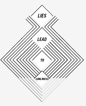
I still had the problem with finding a place to put the text while mainlining a flowing design.
So this option below was what I developed, to form a platform for the text to sit, this would solve the problem of the body copy, because each diamond would only contain one word, thus keeping an ongoing theme throughout.

The design also works as the arrow pointing to the deposit slot.

I then realised that this way of laying out the text may be confusing to the reader as they may not know which way to follow the text as it is not really a natural reading layout.
I tried to solve this problem by using 2 separate opacities to help direct the reader.

After asking the opinion of my group on our Facebook group Nathan suggested there was something not right about the text and there should be a constant throughout the diamonds.
I agreed and came up with the option below, where only the diamonds shade has changed and the text keeps constant, this hopefully should direct the reader.

No comments:
Post a Comment