
For the stamp book, I created a document 172mm W x 84mm H creating an almost square book, i want to include the pattern from the stamps to continue the theme.
The book will also be a great opportunity to put more information about the message I am tryng to communicate, The information I will provide will be based around the facts and statistics i researched about standby power, some of the stats are surprising so this may help get results through shock factor, people will be newly educated about what standby power is doing to the environment, shocked by this they will be more likely to participate in the changes.
Outer Cover


As the book should also inform the viewer what they are buying, as I have decided to make all of my stamps first class, I used the area which on the stamps is where the queens head and amount is located, to place the information 6x1st class as well as the royal mail logo.

This is all I need on the front cover I think, not too much information but still informs, attracts attention as well as shows what people can expect from the stamps inside.

The back cover is where I will put one of the stats, keeping the colour scheme and Politica XT font.
I don't want to include the line pattern on the rear cover as I want the paragraph to be the only thing people concentrate on.

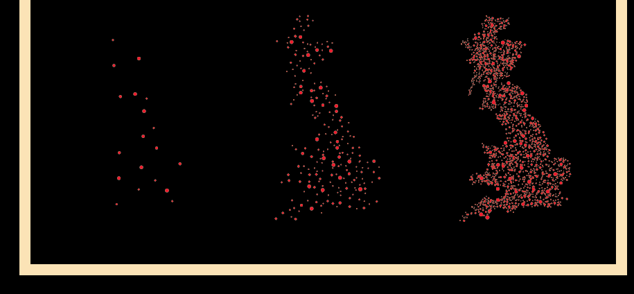
I also thought this would be a good opportunity to put some of the original imagery, it creates a nicer visual when you can see the graduation of the designs all on one page, instead of being on separate stamps.
Doing this also brings my initial idea of simplicity and space back into the design.
As you can see it is a totally different outcome to the front cover, but still follows general themes.


Inner Cover
Another fact will be located in the same place as the rear cover in the same style, and with the stamps on the opposite page, i really dont think anything more is needed.
The fact on the first page is the simple layout

The page with the stamps is the patterned page similar to the front cover.

No comments:
Post a Comment