
I chose this option to digitalise as I do believe it has the strongest visual message, which would definitely benefit the design of the box, to help minimize the confusion of the message.


I wanted colours that would stand out to an audience, the blue would represent it's link with water and drowning, where as the yellow really highlights the man due to the contrast between the two colours.


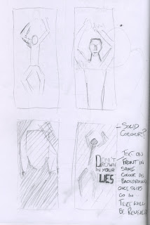
The type was just a quick Idea I just wanted to get down, mainly focusing on making it hidden type until it is revealed by the slips filling the box up.
At this stage i am not particularly bothered about the layout of the type but just want an example to be able to present to the group on Monday, if hidden type is chosen as a good option to incorporate into the design then we will be able to work as a team to develop the type layout.

'Lies' I wanted to be seen all the time by the audience, so making it the same yellow as the figure of the man, would mean initially all the audience will see is the figure and the word 'Lies' this would hopefully intrigue that specific person to come and investigate the message of the box as well has hopefully encourage them to interact with the product.

Here is the finished design, as I said before, i am just wanting to get my concept around to the rest of the group, this is not the finished visuals if chosen but hopefully this will give everyone a good enough idea to develop further over the coming week.
No comments:
Post a Comment